Wexel
Stakeholder:
Premera Blue Cross
Duration:
12 weeks
Year:
2018
Credits:
Sakshat Goyal - Interaction Design
Bridget Shefler - UI and Visual Design
John Sykes - UX Research
My Role:
I led the interaction design efforts for the project.
Abstract.
While people find it hard to book a doctor's visit that fits well with their schedule, clinics and insurance companies face enormous losses due to canceled appointments.
As a response, we proposed a mobile app to
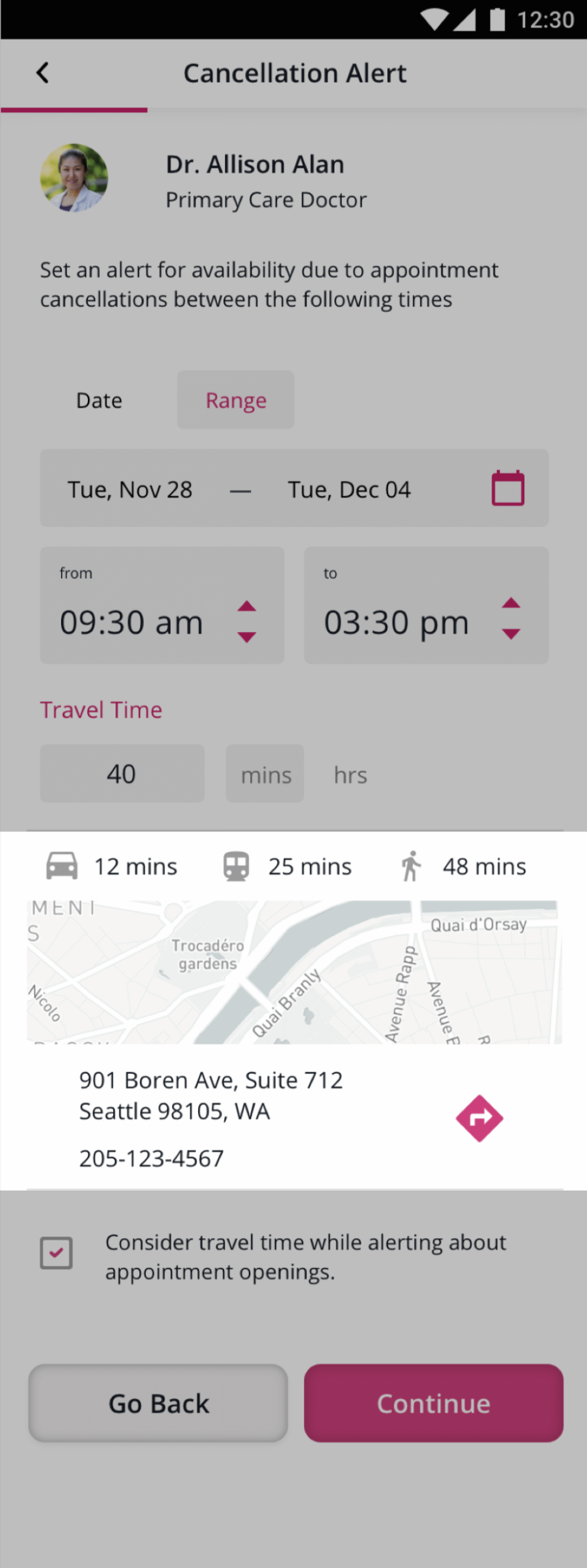
give users the ability to set alerts allowing them to pick up canceled appointments within their desired time frame.
"We are looking to identify, and address, issues faced by informal caregivers finding care for their patients."
- Irish Malig, Stakeholder.
Our design brief was open-ended, so we began our process by trying to identify unaddressed issues in our problem space.
Colllected data from our primary research.
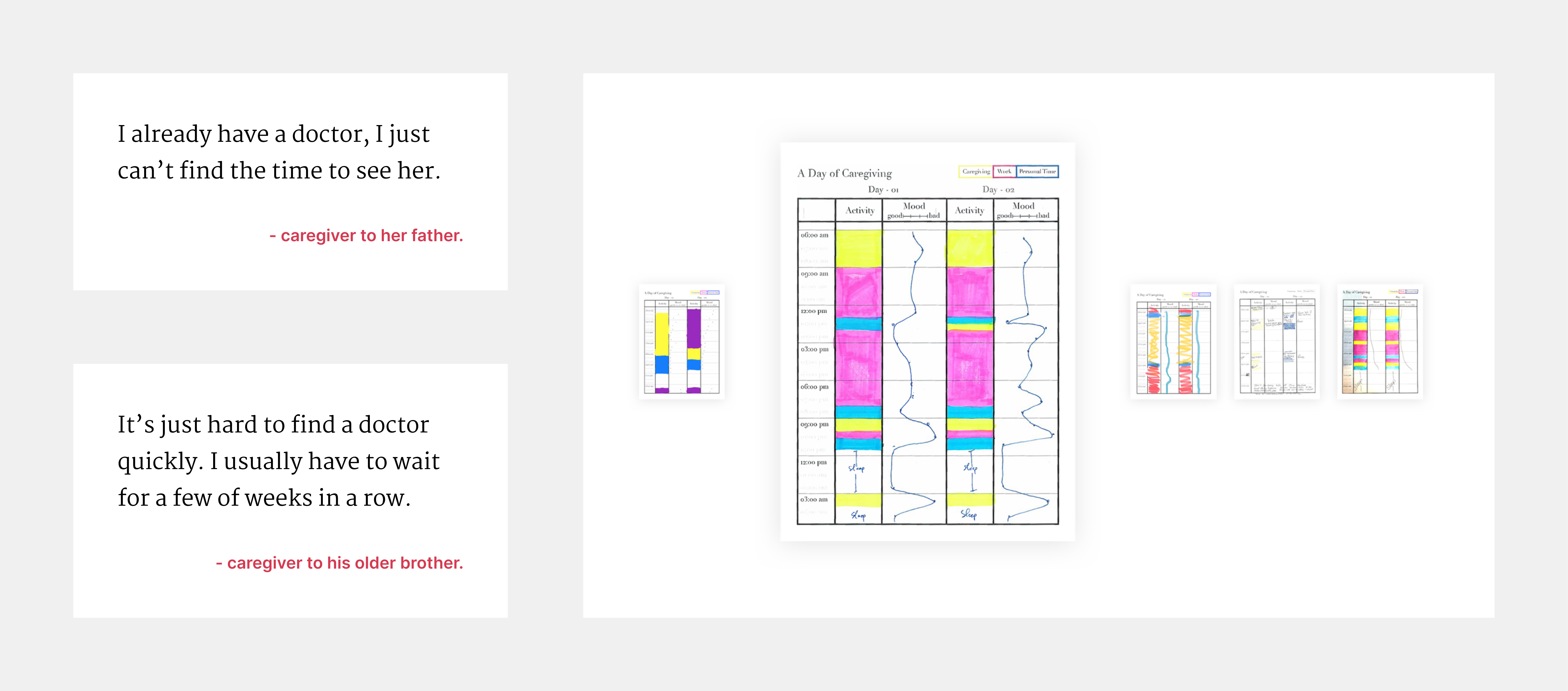
After interviewing 5 informal caregivers, we found that difficulties with time were a common thread in a wide variety of contexts. This made us realize that
caregivers faced issues finding the right care time for care recipients.
At the same time, through literature studies and meetings with our stakeholders, we learned that
canceled medical appointments had a less than 7% fill rate.
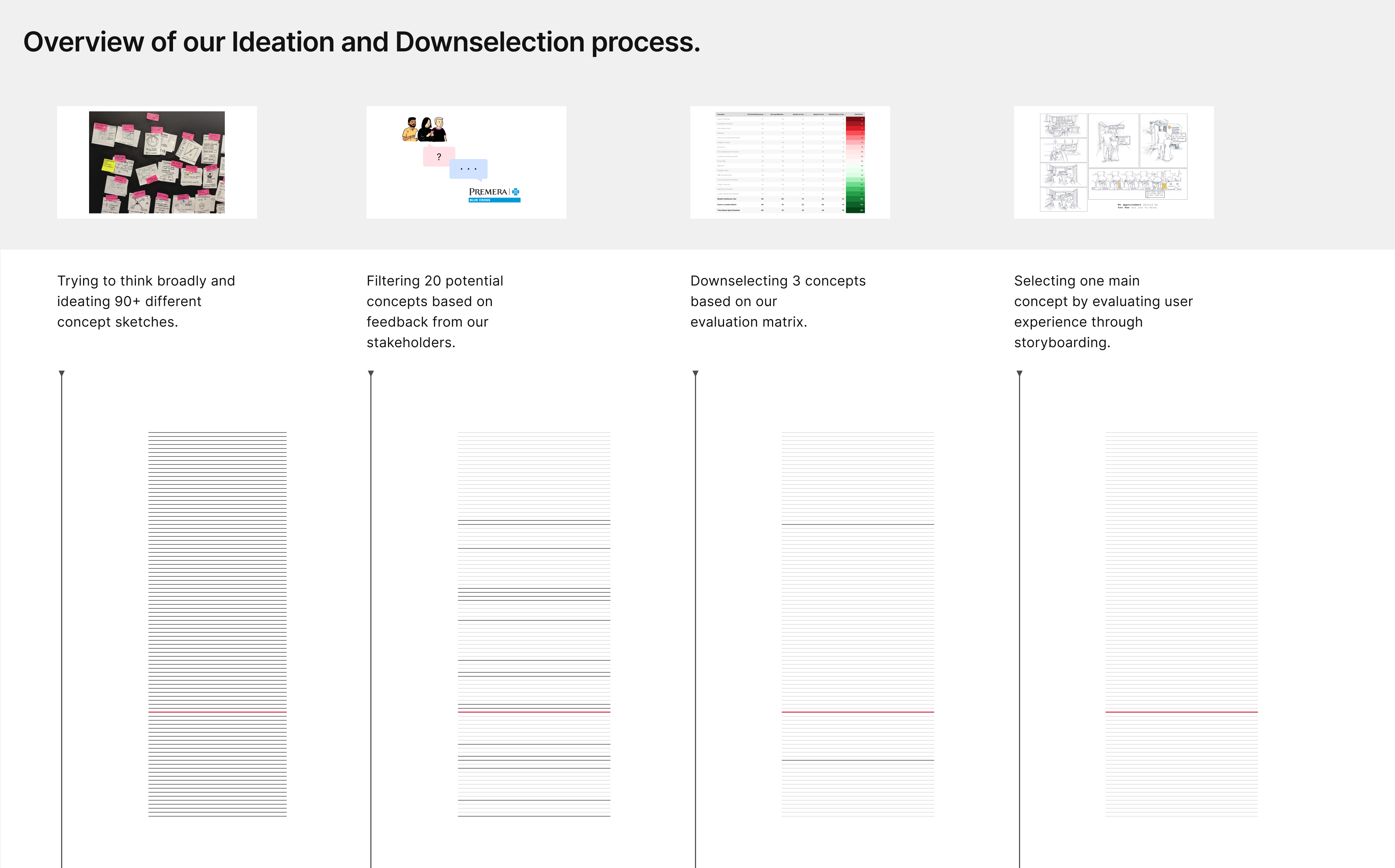
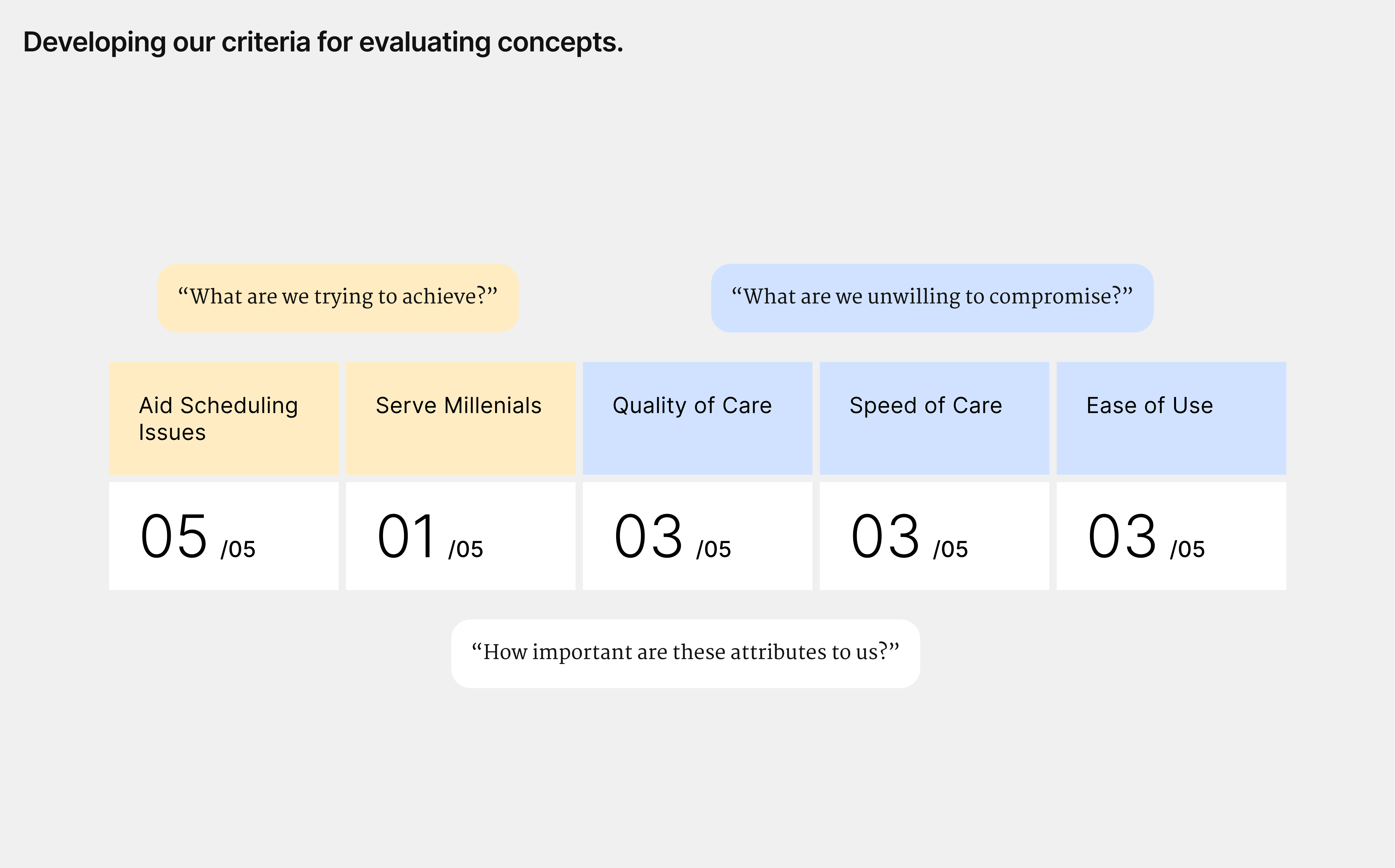
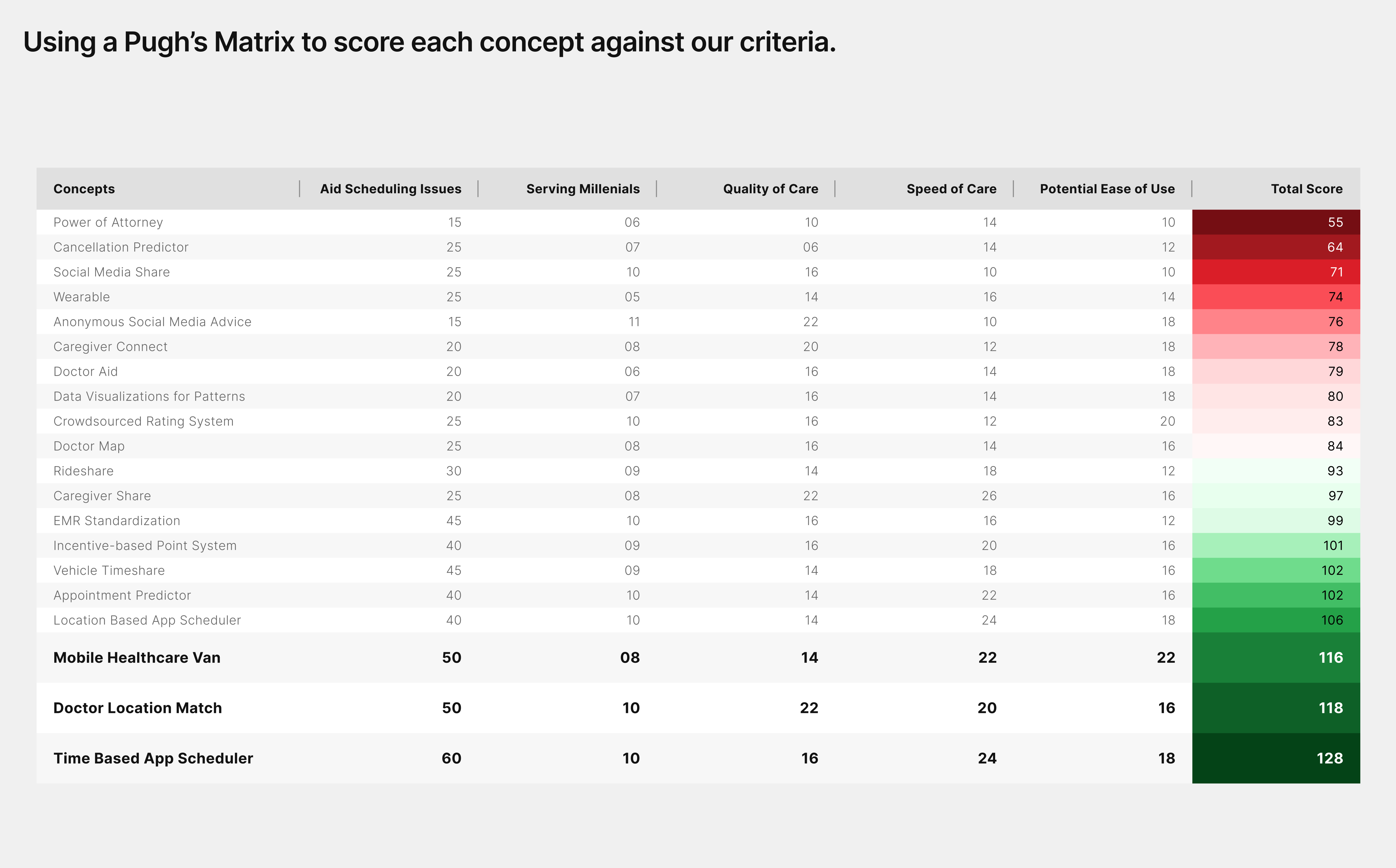
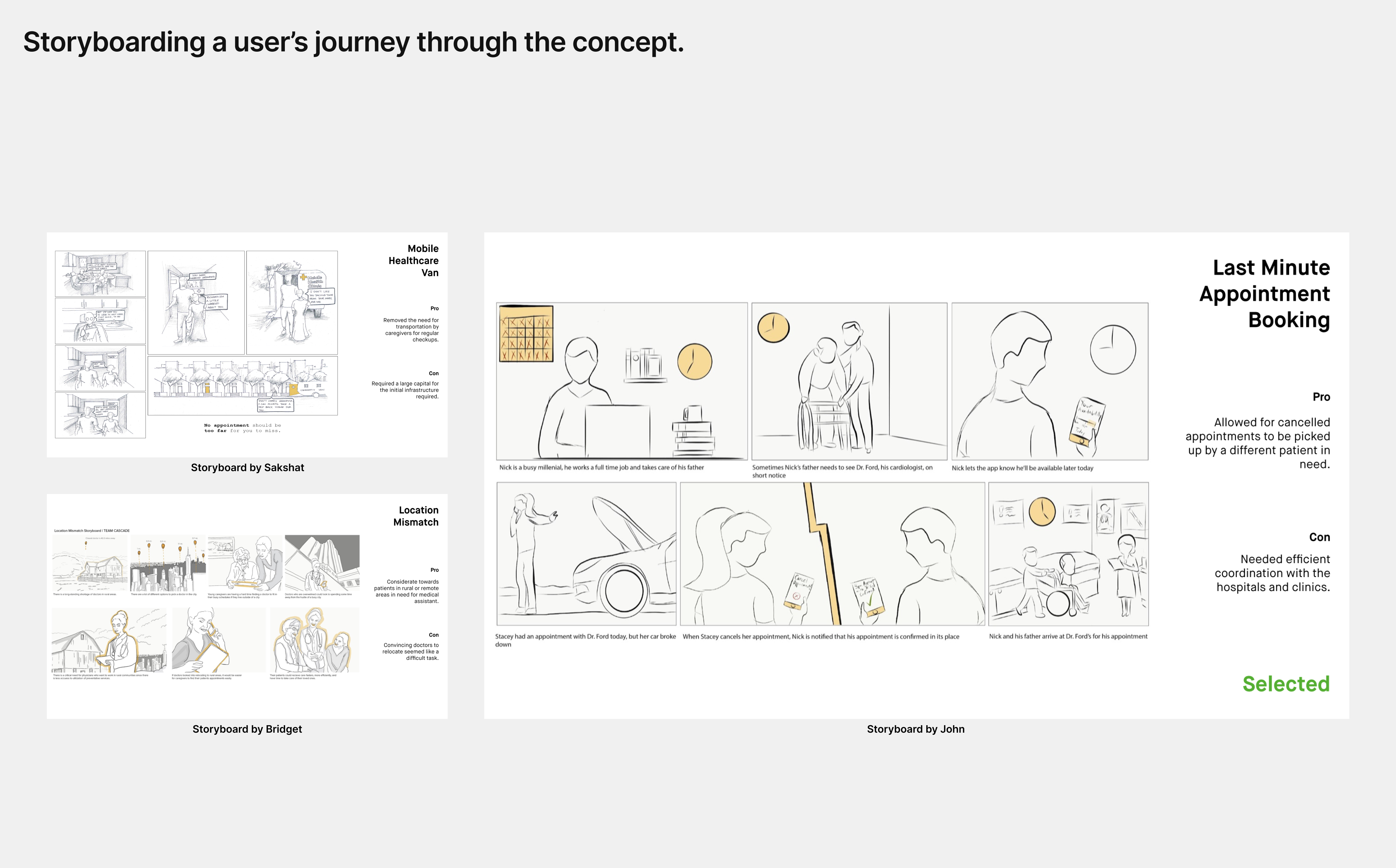
Our approach to finding a solution for further exploration.
A 3-week ideation process helped us derive an idea for the 'Last Minute Appointment Booking' app, later renamed to 'Wexel'.
Out of the 90+ concepts we brainstormed,
we selected the concept with the most potential for allowing caregivers to find appointments at their convenience, while also increasing cancelation fill rates.
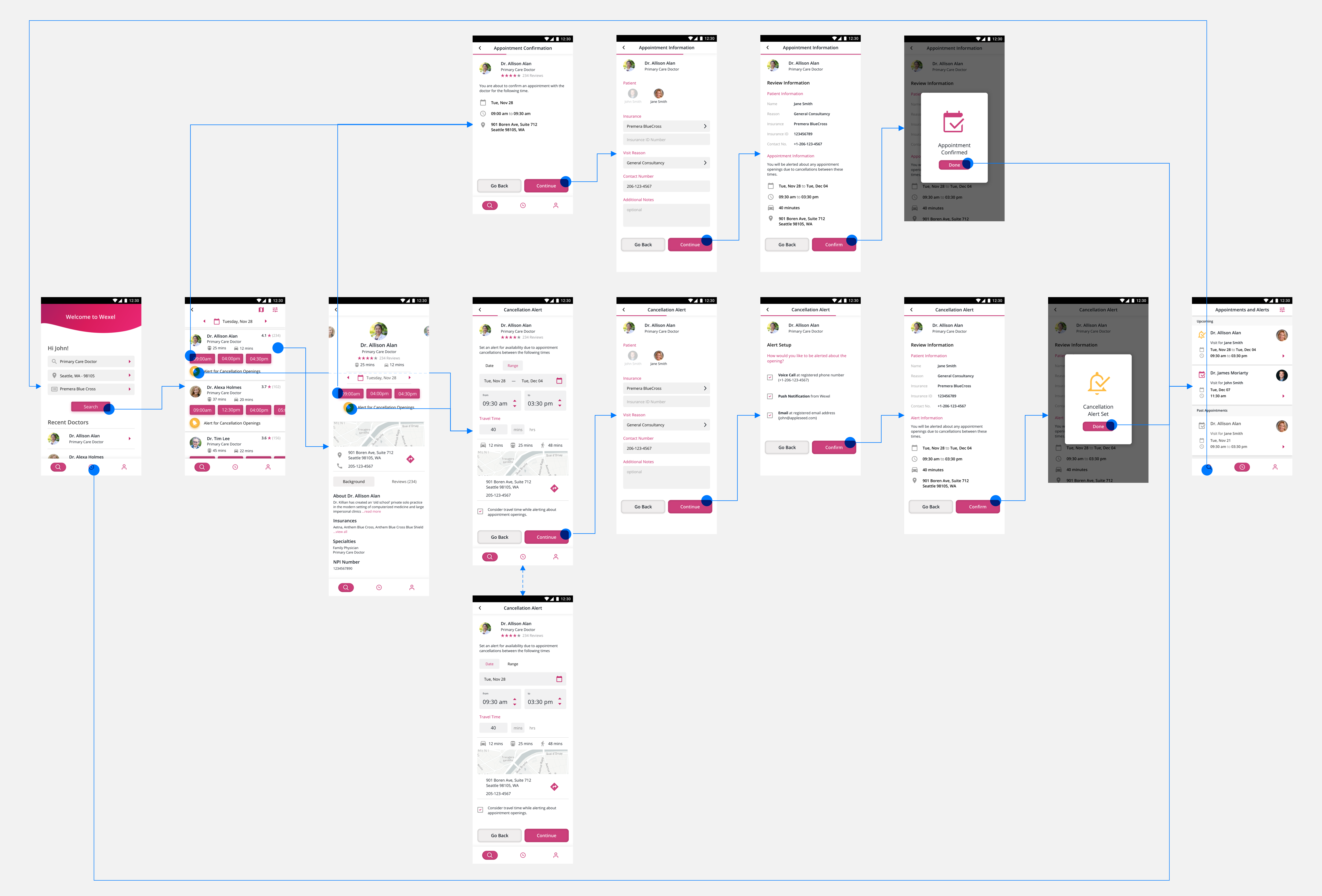
At this stage, it was an abstract concept and we began fleshing out the concept through sketches, digital prototypes, and usability testing.
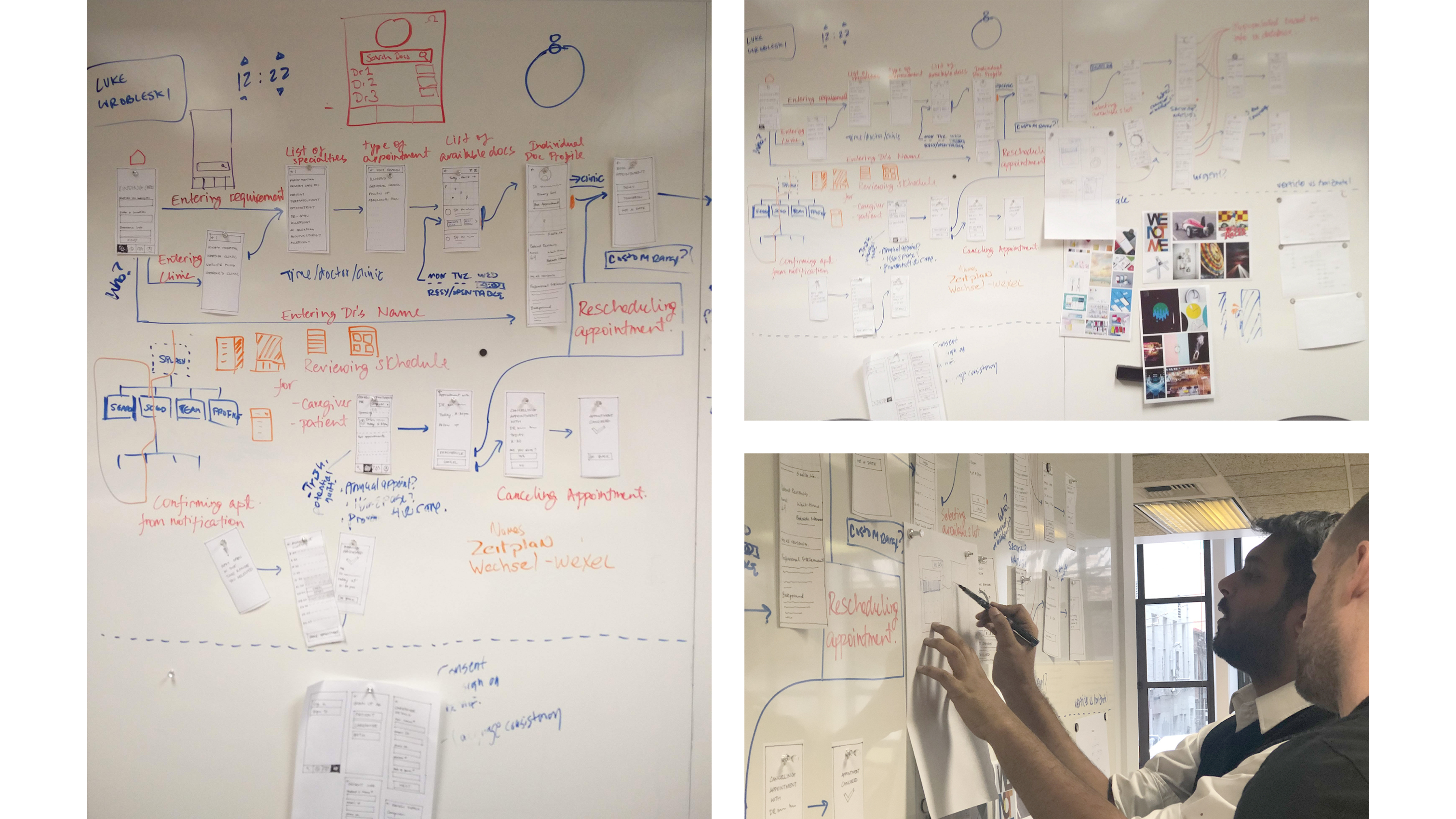
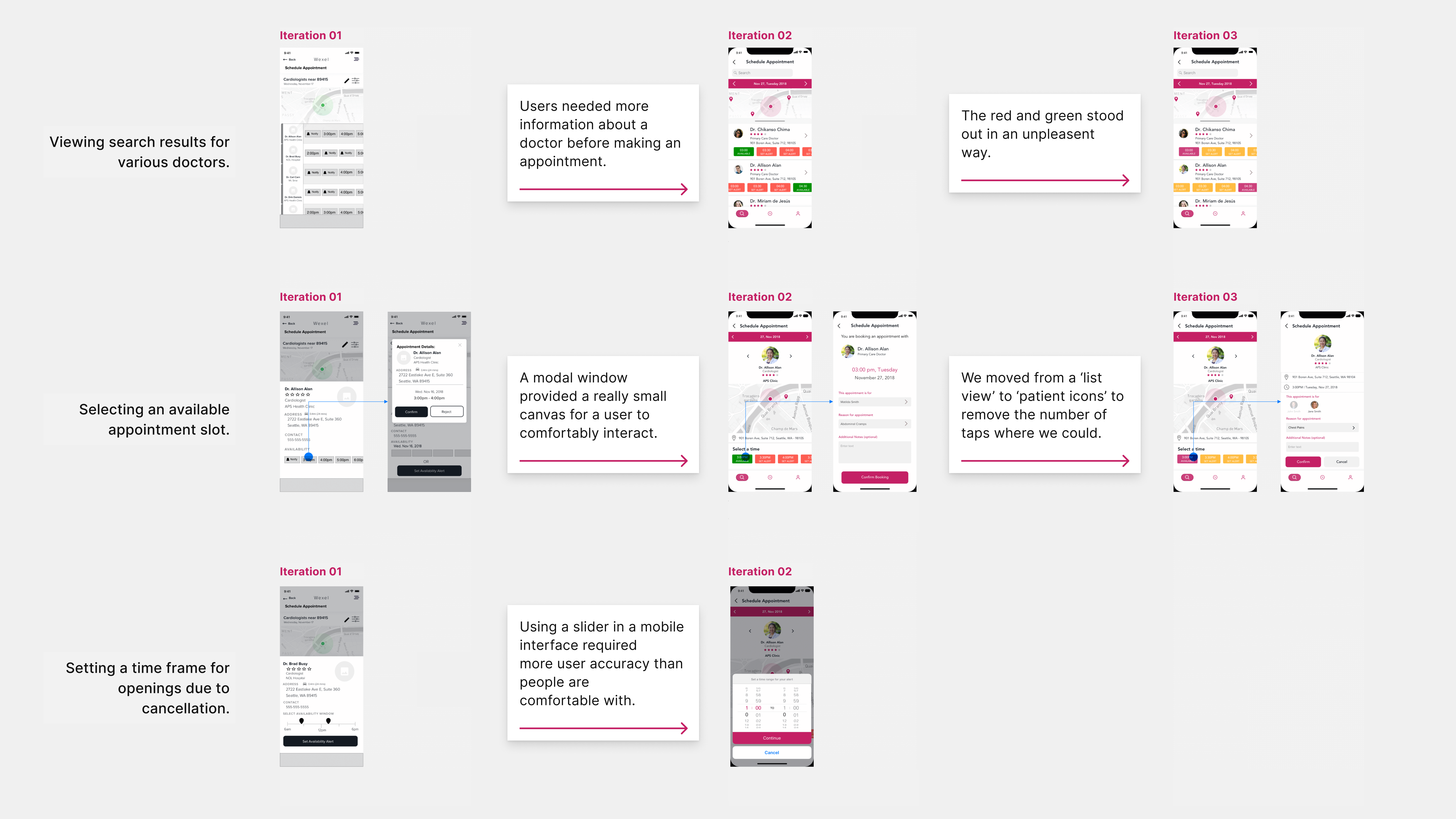
3 iterations modified through usability testing
"I have someone in my family who always needs to see a doctor. If I had this app, I would set alerts every single day and drop whatever I’m doing just to take her to the hospital as soon as I get an appointment for her. "
- Executive at Premera Blue Cross.
At the end of our process, we had the opportunity to present the concept to our stakeholders at Premera BlueCross HQ.
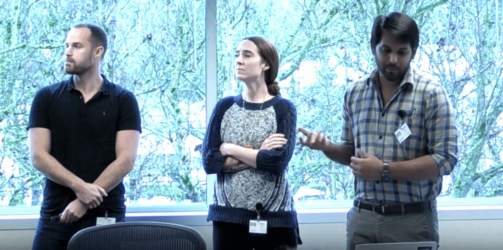
Presenting our design at Premera Blue Cross.
While we had a viable concept that received great reviews from our stakeholders, I wanted to dive deeper and explore means of
improving the app's experience in helping users make decisions about their nearest doctors and scheduling.
I began taking our design to Hall Health and different cafes to get feedback from common users and stakeholders. By watching participants think out loud about their process of making decisions, I identified the following problems:
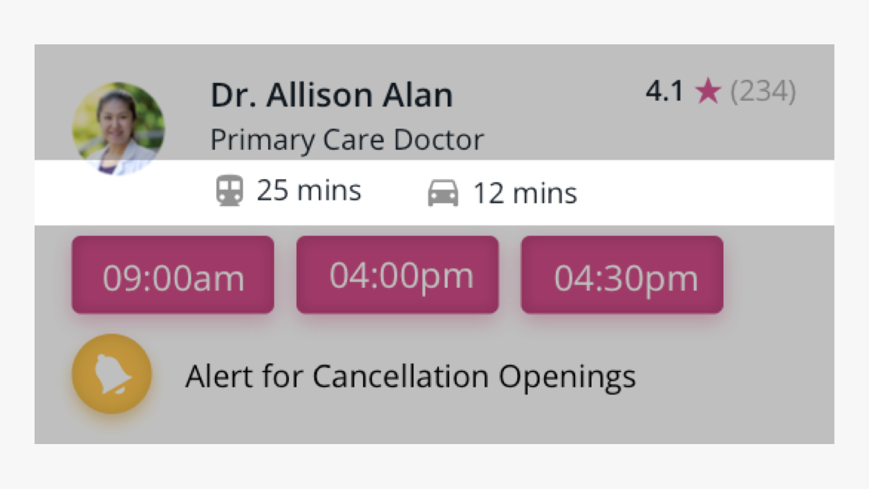
Problem 01:
While we gave users the ability to set alerts for cancellations, participants (and clinics) always preferred if patients selected a confirmed appointment. This meant, they would stop at individual cards within a list of doctors, and scroll horizontally through each block of time. This led to
excessive interaction with the app, and a time-consuming process of looking for an available doctor.
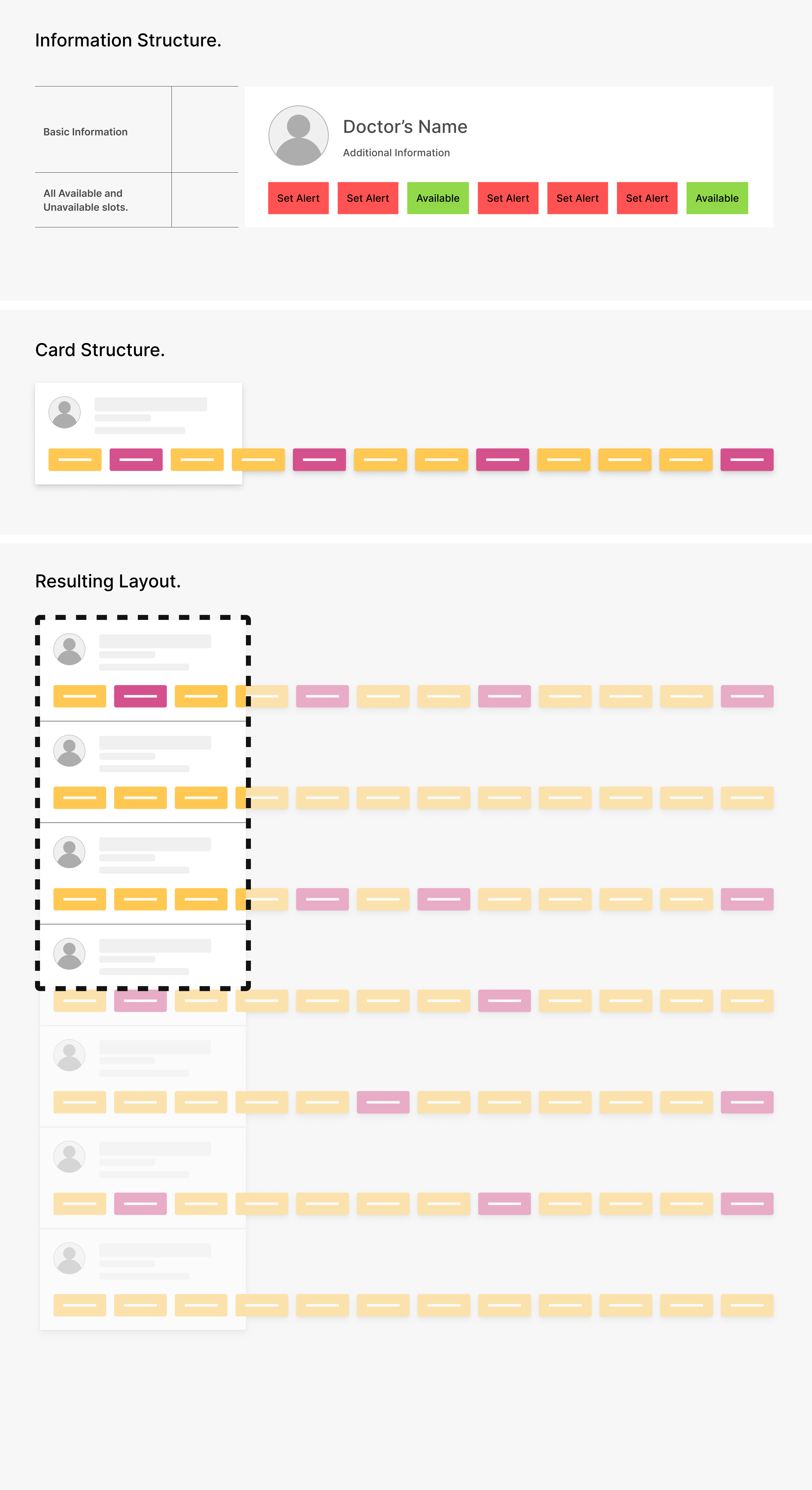
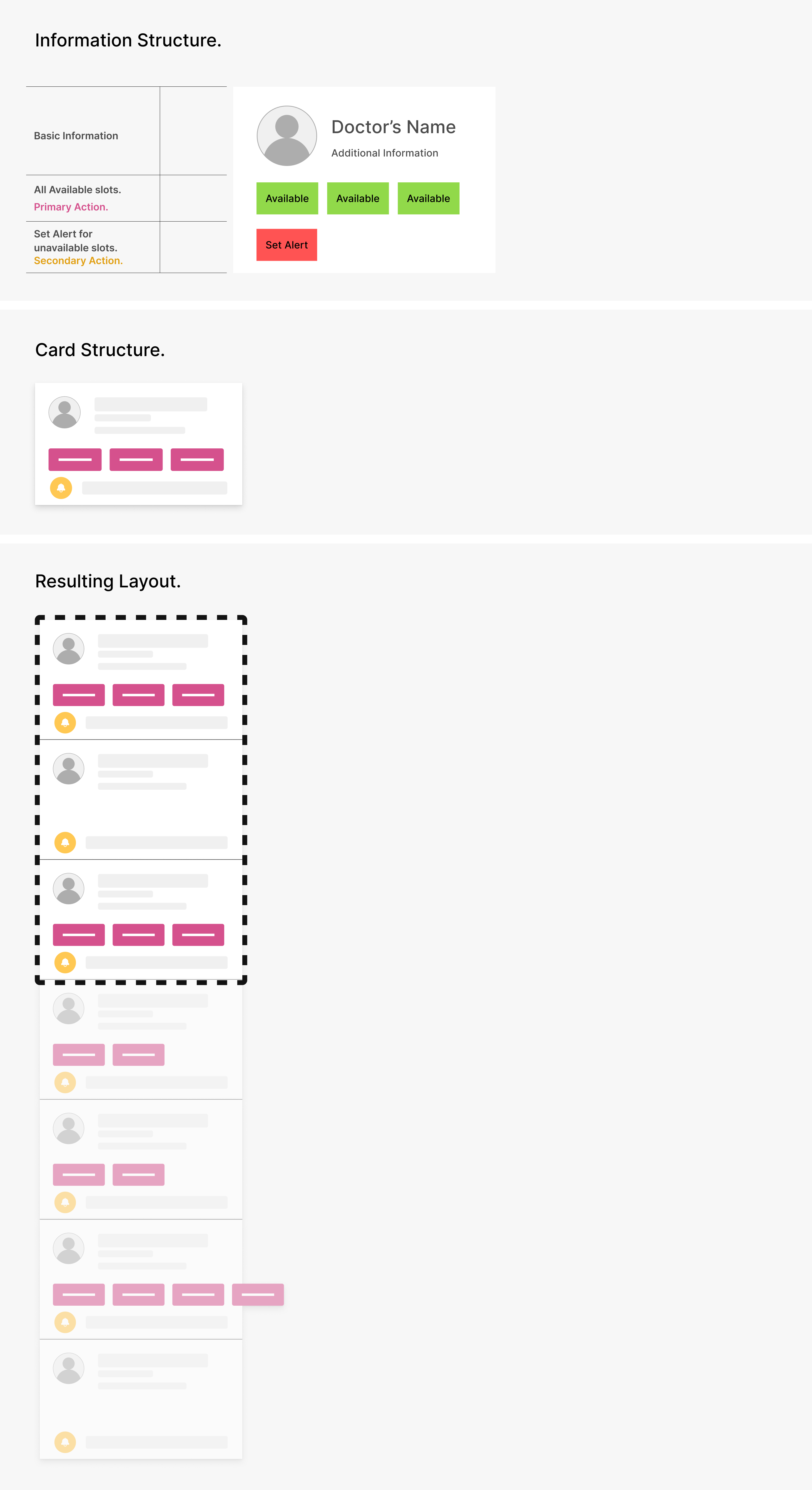
By restructuring the card, every participant was able to make an informed decision through a single seamless scroll.
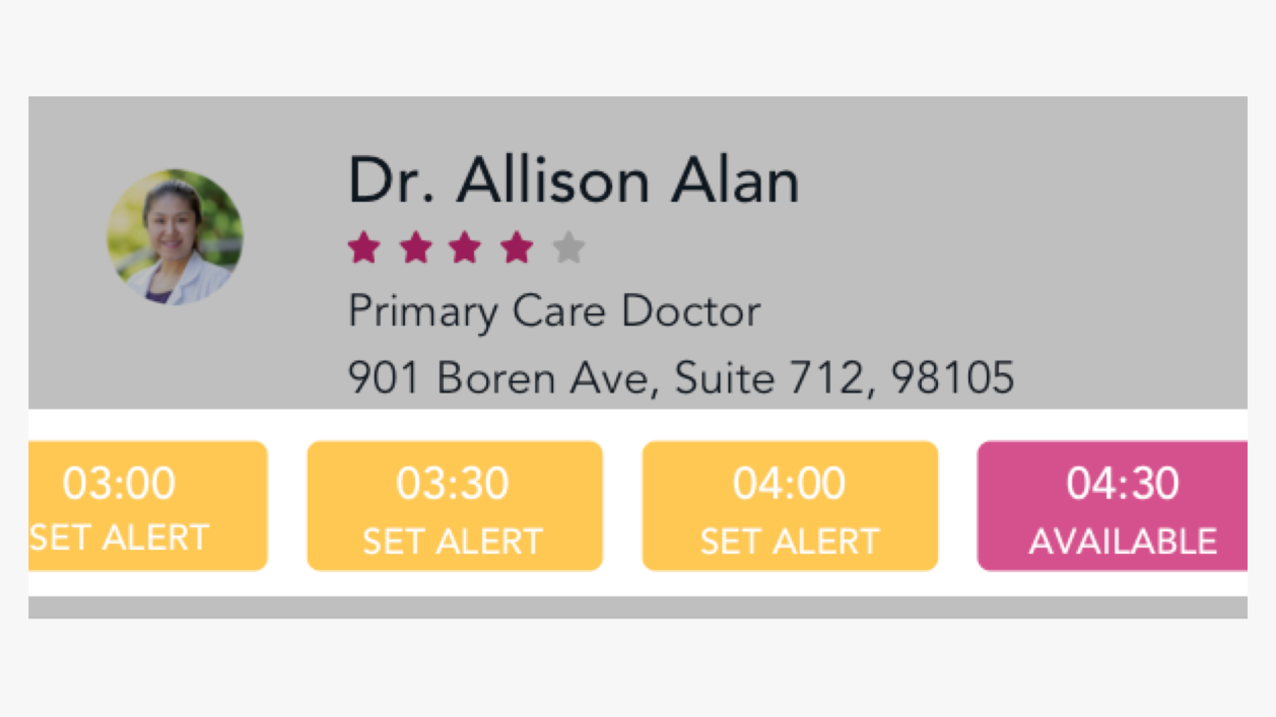
Problem 02:
While people were used to initially looking at locations with an address (or on a map), the process of estimating their travel time based on this data seemed to give users an ambiguous pause.
This led me to hypothesize that:
Geolocations and distances required a level of map literacy not common in users.
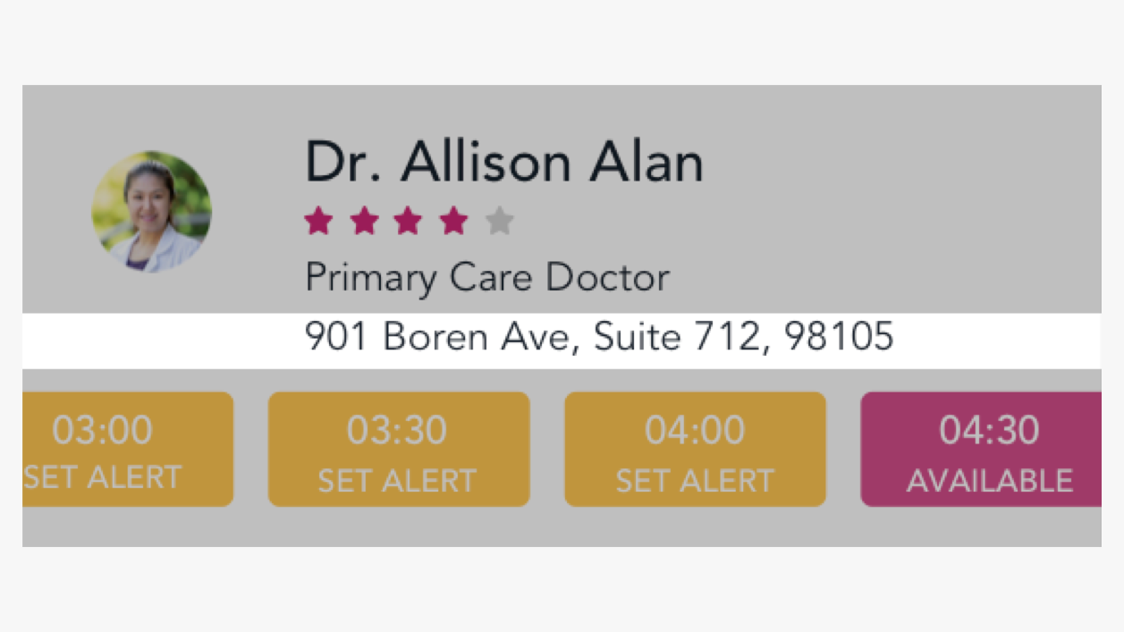
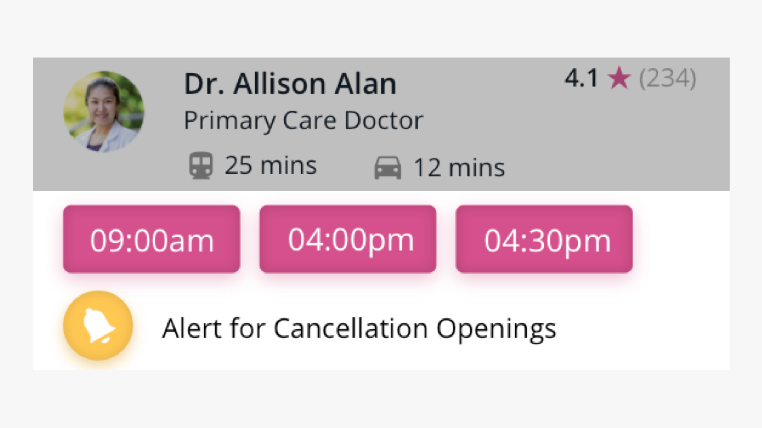
Physical address added as part of a doctor's profile.
By replacing a physical address with an ETA as the key information, I witnessed participants making quicker decisions with actionable information.
Final Iteration.
Reflection:
While the project was well received with positive feedback from our users and stakeholders,
the most fulfilling part of the project was refining our design through constant testing and iteration.
Though I had worked on UX design projects prior to Wexel, we often couldn't witness people using a design in real-time. This helped make subtle observations that went a long way in identifying and resolving finer details in our design.