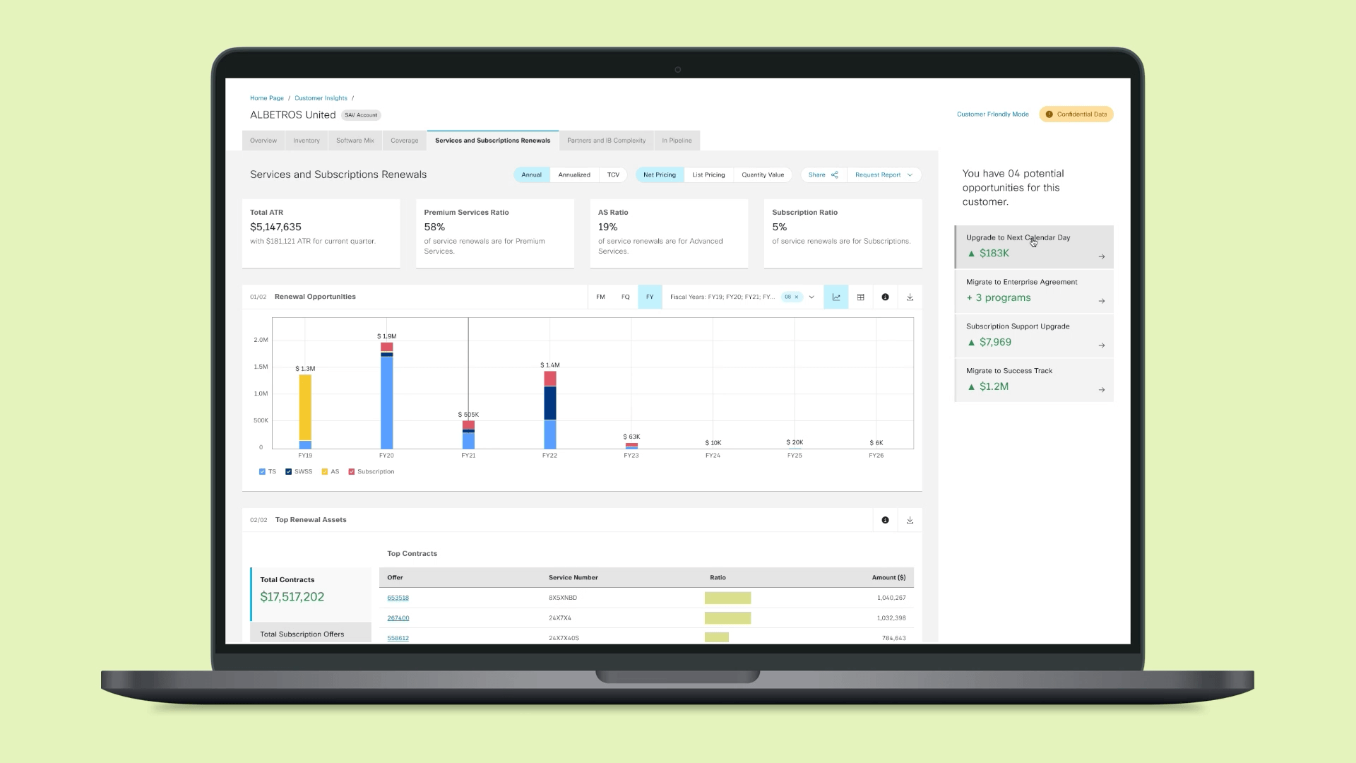
Redesigning Customer Insights.
Stakeholder:
Cisco Ready
Duration:
12 weeks
Year:
2020
My Role:
I led the research and design for our redesign efforts.
Abstract:
Cisco Ready is one of many internal sales analytics platforms at Cisco. Customer Insights, while being one of our prime assets, was also one of our most underperforming dashboards.
I redesigned Customer Insights to help minimize the effort required by users to formulate a customer strategy.
Once Cisco's account managers began seeing more value in our redesigned platform, they began encouraging their account teams to start using the same platform for their initial analysis.
Attracting account teams in addition to account managers led to a 40% increase in our users within the first 4 months.
Before/After
My first hypothesis was to have a platform that had everything an account team might need for their analysis. This led to
the first big challenge, define what 'everything' meant for our users.
Potential Users for Customer Insights.
While I had a basic knowledge about the problem space, at the time I was not equipped to ask specific questions to identify design opportunities.
To resolve that, I focused my interviews on my participants' memories from the last two times they met with their customers. It was quite fruitful since a customer meeting is one of the few occasions our users collect all the information they need to strategize.
After interviewing 12 participants from 3 different countries, I learned that
most managers had a simple set of questions they try to answer while preparing a strategy.
A typical customer report.
Sample pivot tables created by users.
Our participants were kind enough to share some of the pivot tables they created to help us get a good sense of their customers. A deep dive into the process of
trying to answer those questions gave me a clear picture of what 'everything' meant for a typical user.
Making sense of everything we received from our participants.
"Making pivot tables in excel takes time...
...but it's the only way to do a thorough analysis."
- Account Manager
What surprised me the most was - despite the resources spent by Cisco on creating tools for their workers, workers still had to navigate multiple channels to get basic information, and excel was helping our users more than Cisco's tools.
I hypothesized that we could bring a large audience by minimizing the need for custom analysis on spreadsheets.
I began ideating different visualizations that could help users answer the critical questions, while also trying to provide any additional information our stakeholders wanted account managers to keep in mind.
A snapshot of ideated concepts.
The ideation exercise and the customer reports helped me understand that we could create a set of repeatable modules that allowed users to drill down their visualizations.
Constructing modules helped us create recognizable patterns for the users and streamline our backend development.
Modularizing visualizations through data tables.
Complete collection of all our data analysis assets.
"It generally comes down to a few basic questions. Like,
How big is this customer?
How many products have expired?
How many services are available to renew?"
- Regional Manager
For an efficient user flow, we had to address a critical question -
Where would a user begin?
The conventional approach was to start with a quick overview of the customer and slowly unfold every detail about that customer.
In theory, the previous version of the Customer Insights was the ideal landing page for any user since it really did give an overview of a customer. I didn't want to dismiss it right away. In order to encourage a healthy discussion,
I developed two opposing principles and tested them through their resulting designs.
Provide cataloged visualizations to users that give them the freedom to make a decision based on their analysis.
Existing version with the actions for further exploration.
Provide curated data to users that inclines them to take specific actions based on predefined benchmarks.
Proposed Version with Key Performance Indicators.
I tested the two approaches with users and consistently saw that
the simplicity of deciding their next step without analyzing a data visualization was a breath of fresh air for all our users.
Though there was a lot of excitement about color-coding tiles based on benchmarks, we couldn't move forward with the idea due to the unique and complex attributes of all our customers.
However, the concept of having tiles gave us an opportunity to introduce a hierarchy to all the information we displayed on our pages.
Information Hierarchy.
Complete Design.
"My colleague just shared the new customer insights page with me. This is such a time saver!"
- Account Manager
"I love the 'Never Covered' toggle you've added. It used to take me hours to format that data."
- Renewal Manager
"This is perfect! Let's do the same for Sales Levels 4, 5, and 6."
- Regional Manager
Conclusion:
By conducting a thorough analysis of our users' own method of drawing conclusions through pivot tables,
in addition to bringing more account managers to our platform, we picked up a large portion of the sales team who only conducted their analysis through customer report spreadsheets.
Cisco has multiple teams that develop upgraded services, offers, and buying programs for Cisco's customers. With the increase in our user base, we began getting requests from these teams to promote their offers on our platform. This is further elaborated in the next project, Upsell Opportunities.
Since the data was curated specifically based on user workflow, we drew the attention of the company's sales and customer experience leadership. As a result, today, Customer Insights' format is also used for analyzing entire sales regions, rather than just individual customers.
Update as of Nov 2021:
With Customer Insights, I was able to define a system for evaluating a single customer.
This format became a benchmark and was reused for a 'Global Insights' page meant for evaluating several customers with a common lens.
Each query for individual datasets was repurposed from capturing data for one customer to capturing data for several customers.
Repurposing the Customer Insights datasets for Global Insights.
What I learned:
Having a well-articulated and justified roadmap for research and design was key to winning over stakeholders.
It is a common perception that stakeholders, at times, are unwilling to invest time and resources into exploring the problem and focus more on quick solutions.
Advocating for design thinking is a perpetual part of the job, but people listen as long as we can provide valid justifications, case studies, and a clear timeline.
Addressing user problems should always go hand in hand with achieving desired business goals.
Though our original version was intended for account managers, most decisions were always skewed towards the needs of executives, due to the consistent need for project funding.
While the needs of executives were not ignored, we were only able to achieve drastic results by keeping the needs and methodology of our core audience at the center of our design process.