Redesigning Cisco Ready.
Stakeholder:
Cisco Ready
Status:
Ongoing
Year:
2021
Credits:
Sakshat Goyal - Design Lead
Monika Zochowska - Product Owner
Shravan Chouti - Lead Developer
Dmitry - Product Owner
Patryk - Manager
My Role:
I created a unified design system along with interface guidelines for the new Cisco Ready.
Abstract:
By mid-2021, Cisco Ready had 2.5x as many Cisco users as the same time the previous year. As we continued to grow and bring in more users, our team wanted to treat Cisco Ready as its own unique product within the Cisco Family.
While this is a large, ongoing project, this case study covers just a few aspects in brief.
01. Restructuring our asset library
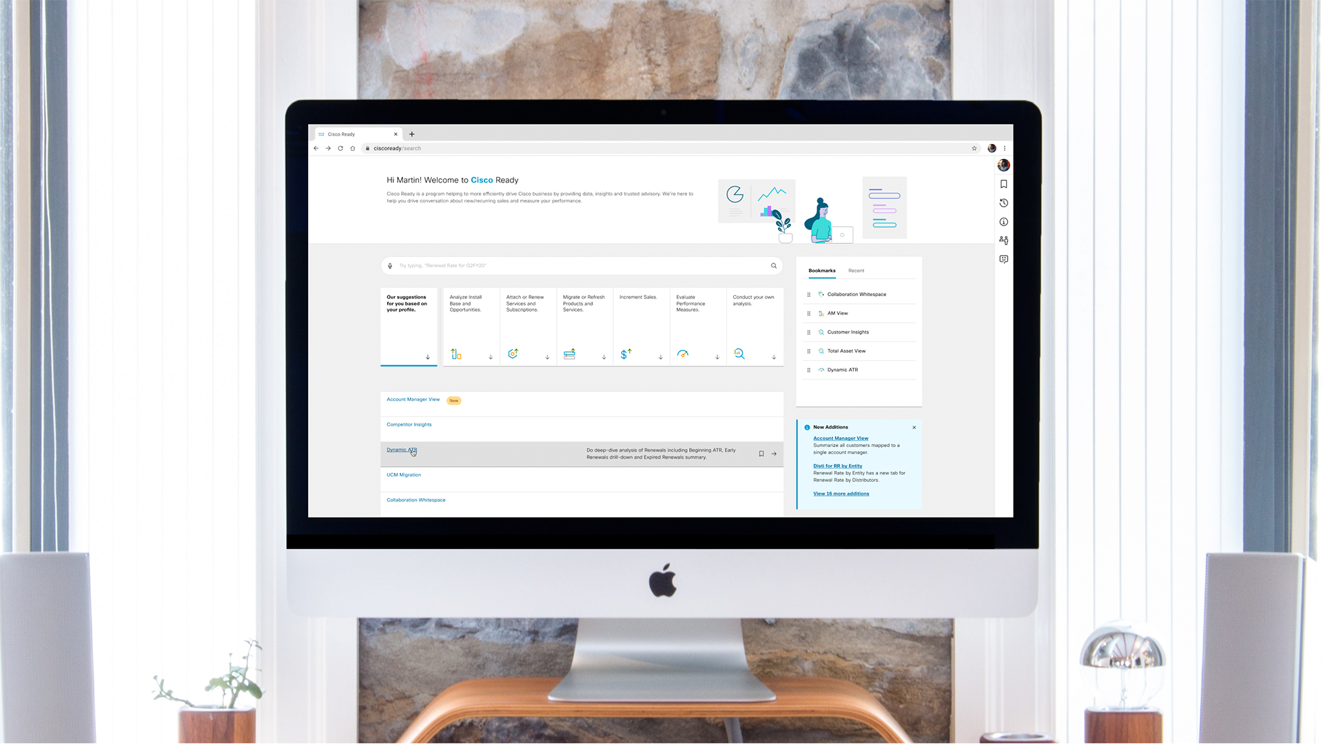
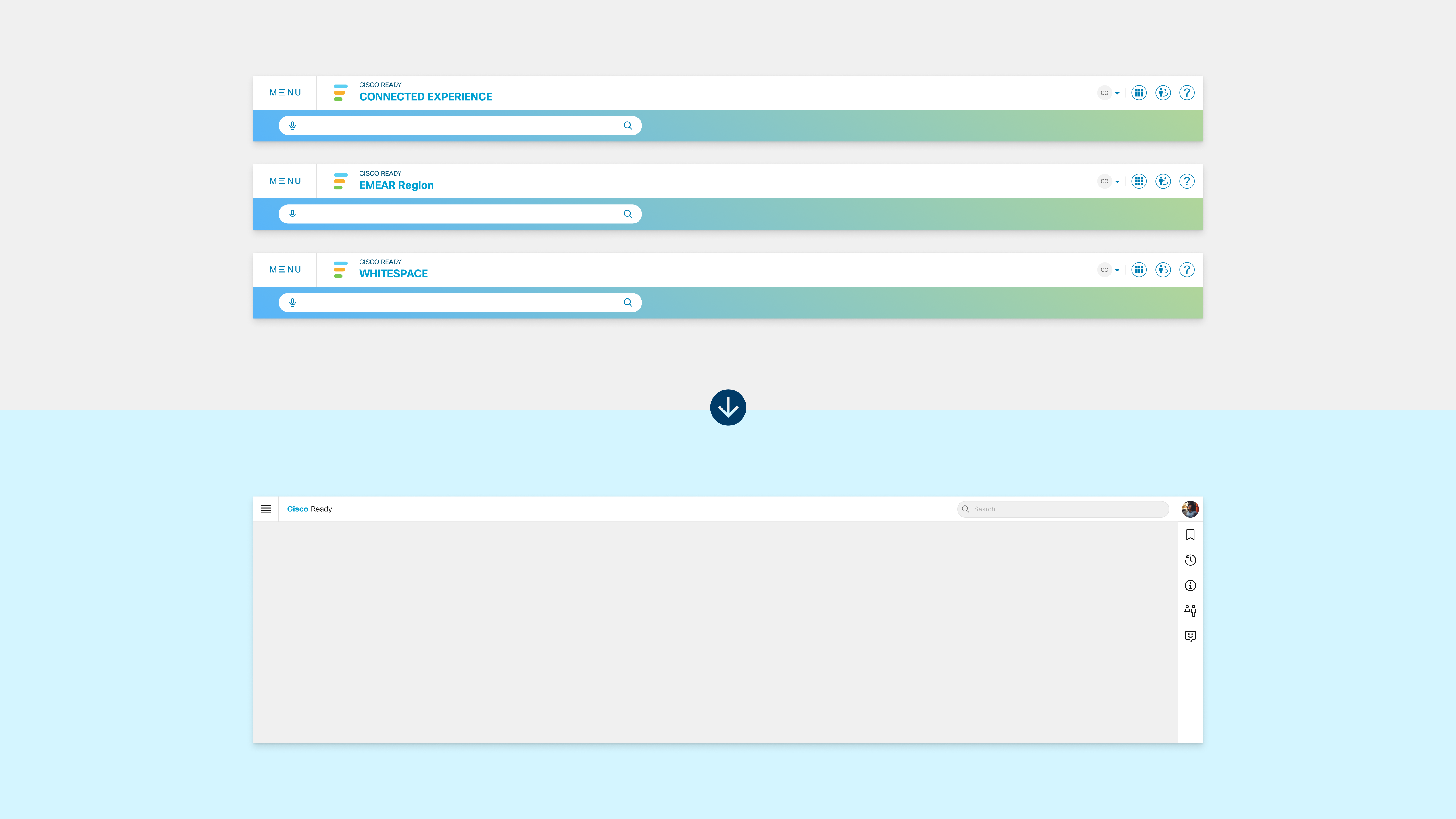
Cisco Ready is essentially a library of different analytical tools used by Cisco's business team. Our biggest problem was that users could never find what they were looking for due to the way they were categorized.
In mid-2019, the team wanted to address this issue by introducing a smart search bar. However, a good search bar was not able to make up for inadequate navigation.
I restructured our library based on user activities over their business designation.

Restructuring our asset library.
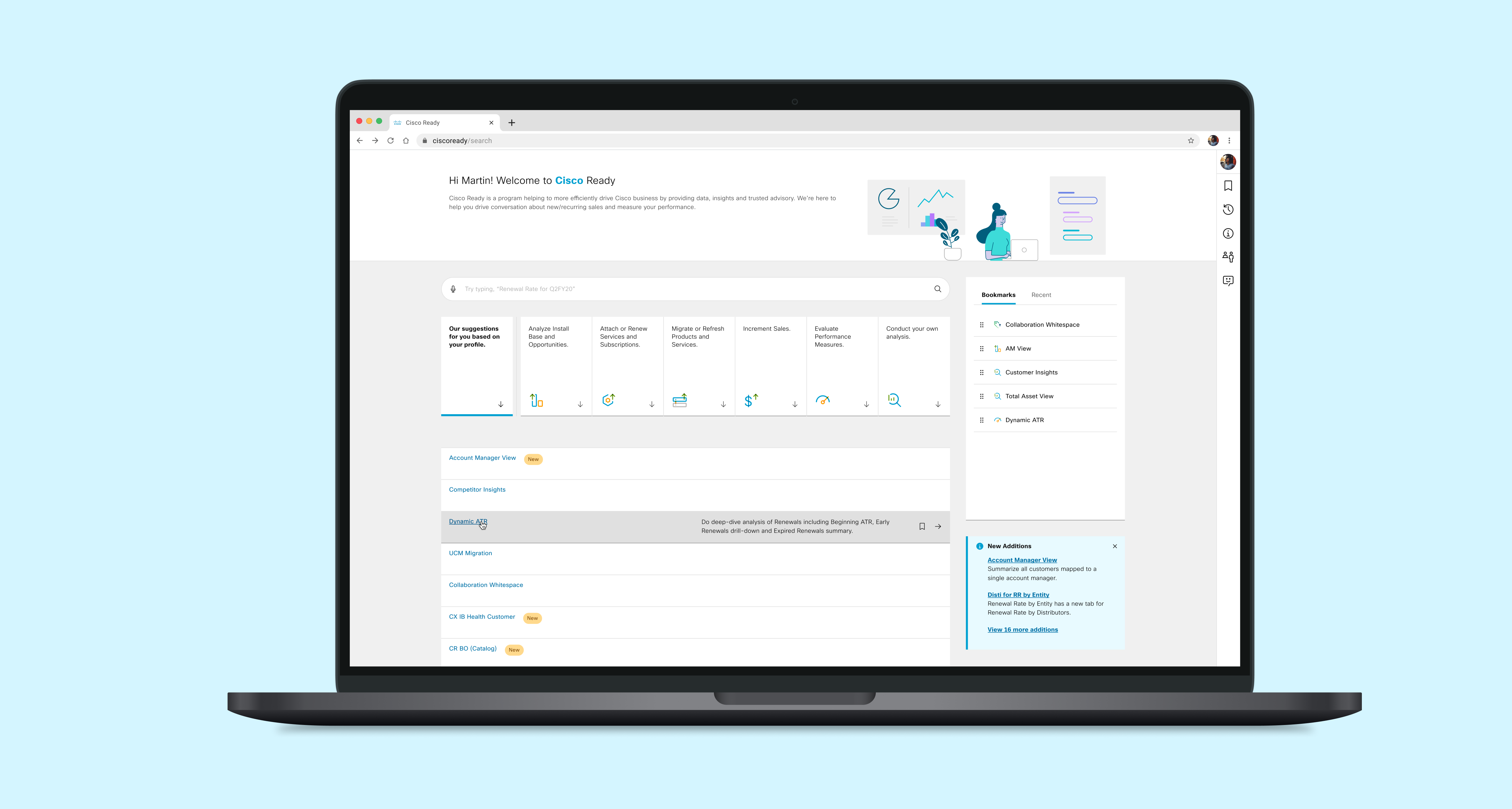
Before/After of our landing page.
Our testing showed that while users were able to intuitively navigate to their desired sections, they were also more open to exploring different assets Cisco Ready had to offer.
In the process, I created a series of new icons by adopting Cisco's visual accent. Our team now uses these icons as a means of building Cisco Ready's brand identity while talking to different stakeholders.
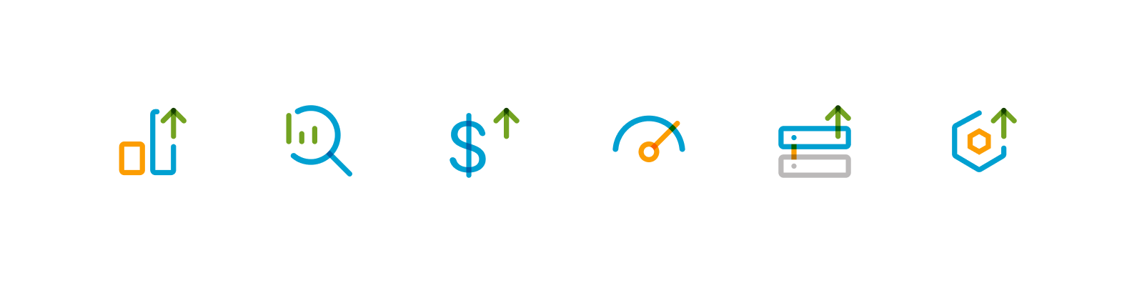
Icons for our asset library, currently used as the product's brand identity.
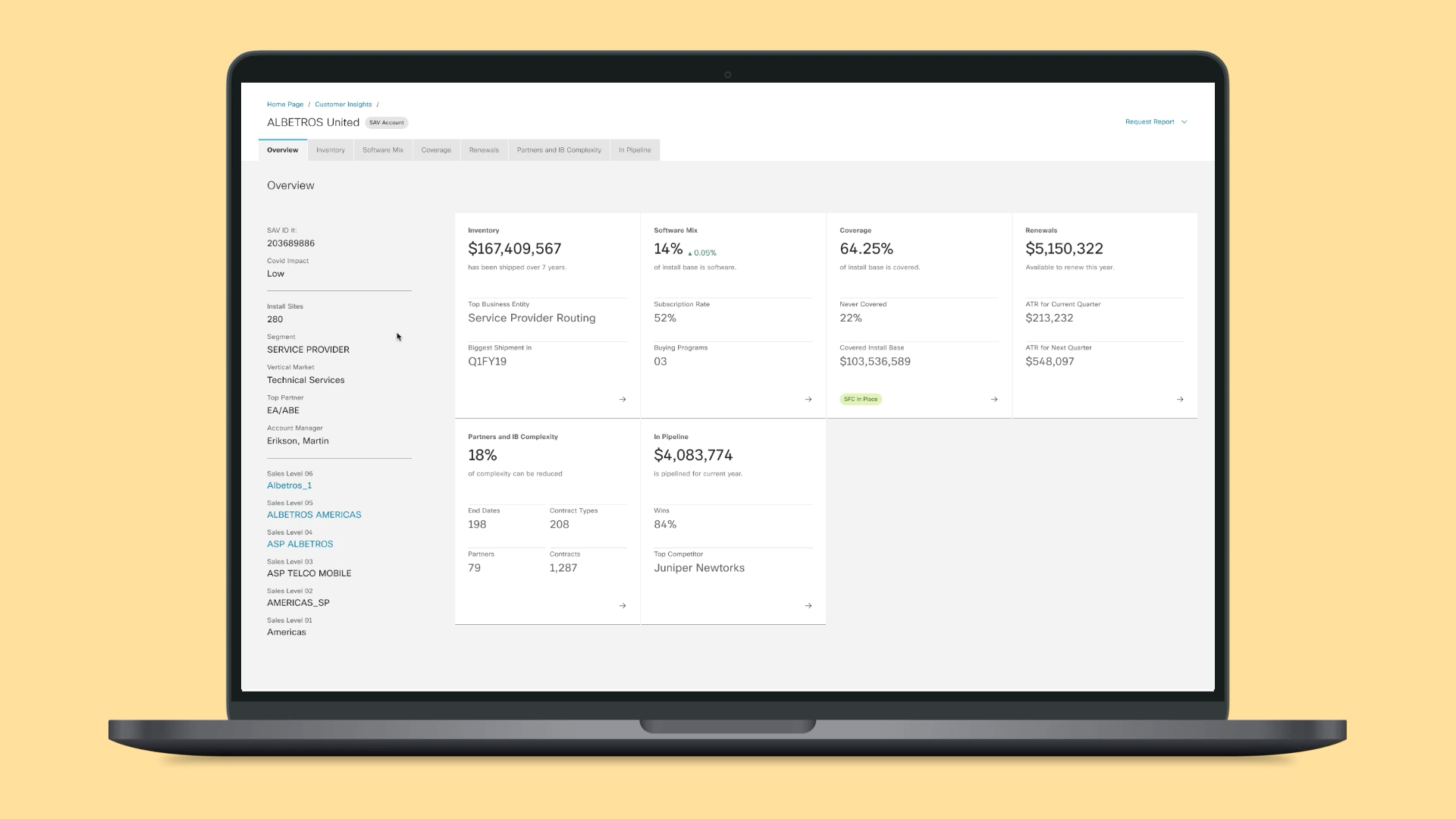
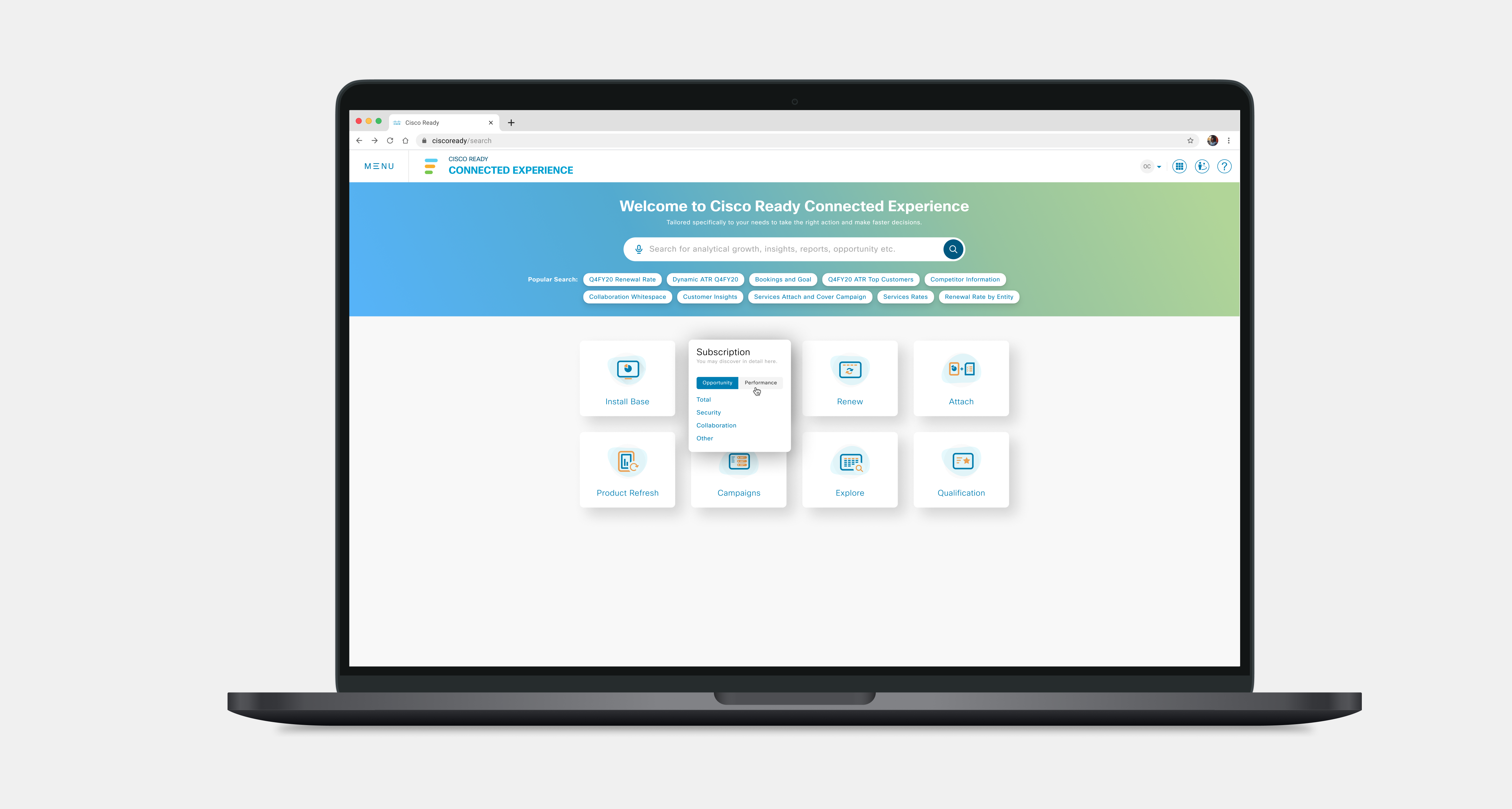
02. Unifying our UI Shell
Cisco Ready has a number of branch products (Connected Experience, Next-Gen, CR for EMEAR, CR for Americas, etc.). Thanks to a massive effort by our development team, we are able to merge these platforms and curate collections based on employee security levels.
I redesigned our UI Shell giving more room to the content on our page and grouping additional features for Cisco Ready.
Merging multiple UI headers.
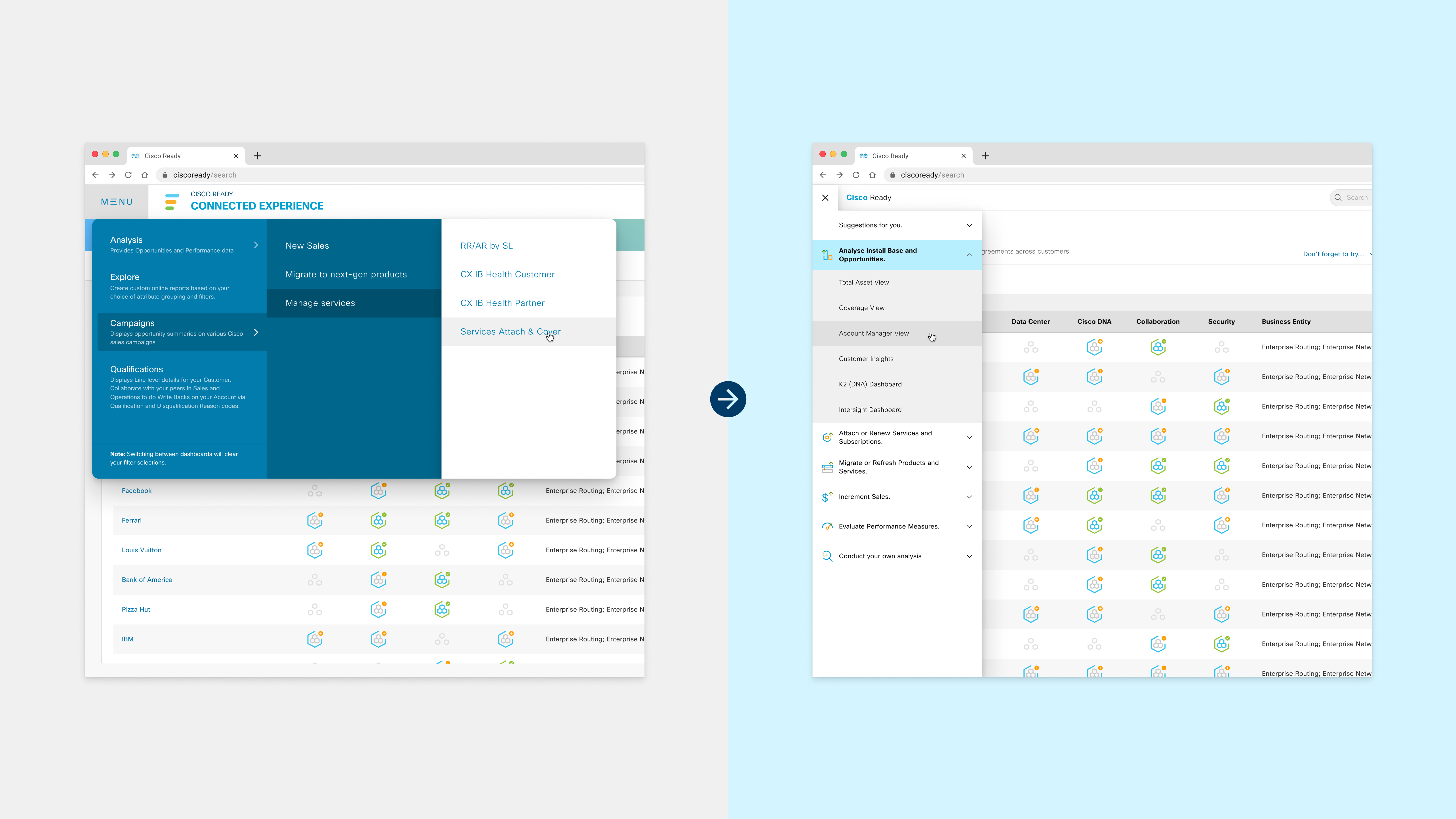
Redesigning navigation to accomodate the restructured asset library.
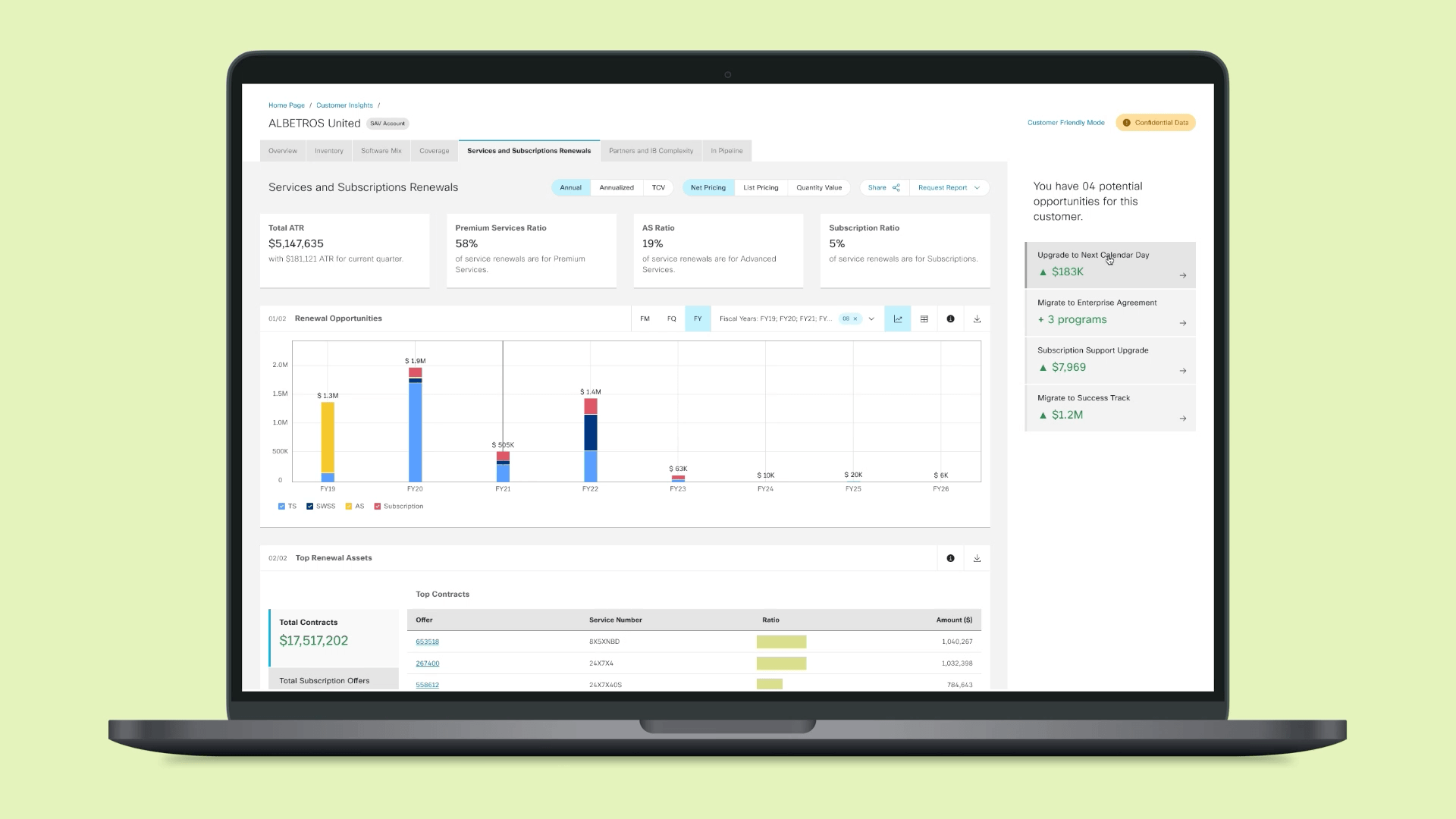
03. Redefining the Filter Experience
Cisco Ready had two distinct systems for filtering data:
- Filter Panel, which had a filter for every type of dataset
- Curated Filter Bar, which had a select few filters most relevant to a user's immediate activity.
Each type had its problems, while also trying to solve an existing problem. I redesigned the filters to get the best qualities of both experiences.
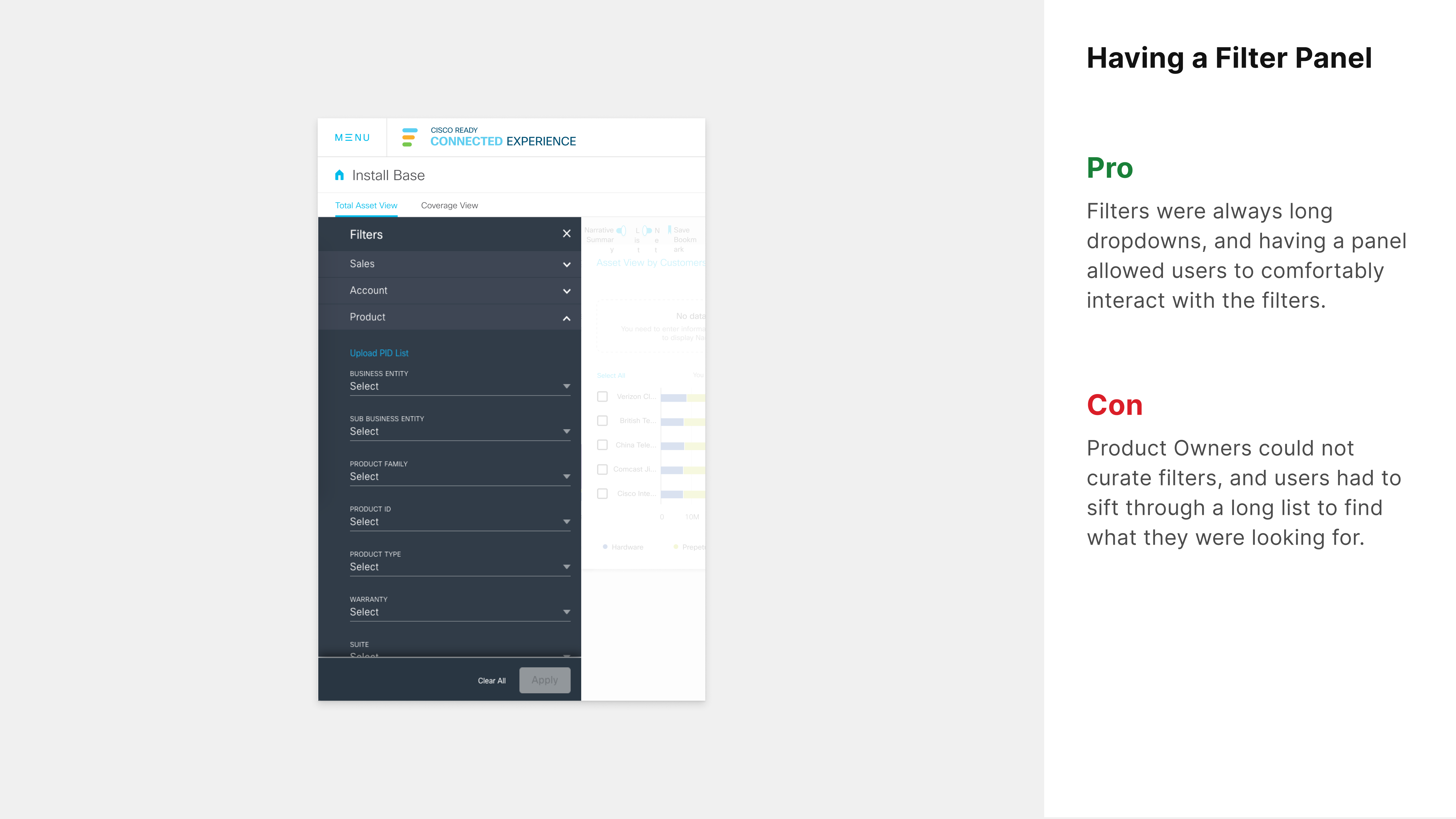
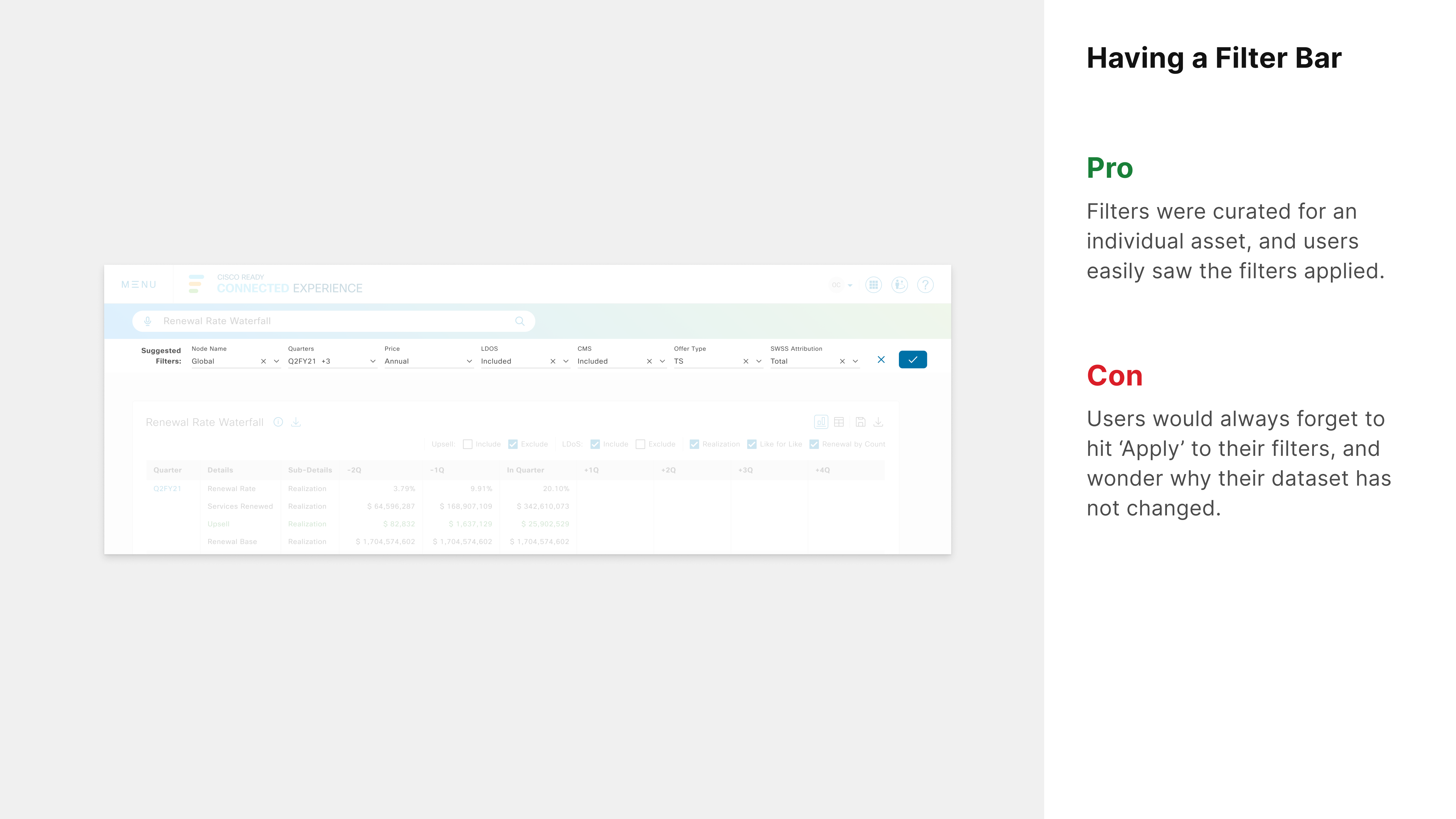
Existing filters, pros and cons.
Filtering was one of the most critical aspects of the user experience, so we made sure to test our design with users across the globe based on the following criteria.
- Are users able to identify where the filters are?
- Are users able to identify the filters applied?
- Are users able to apply filters without any errors?
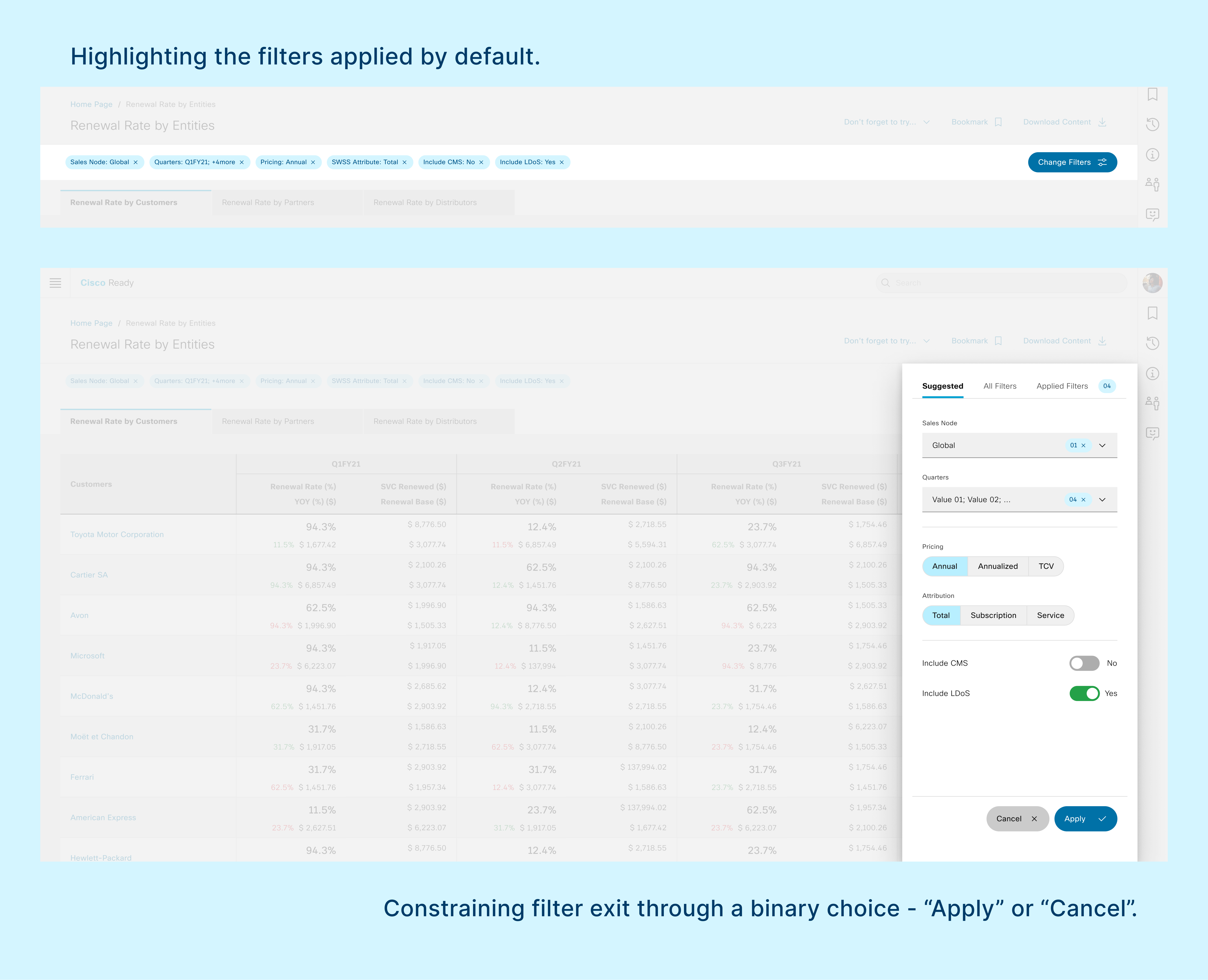
Redesigned filters.
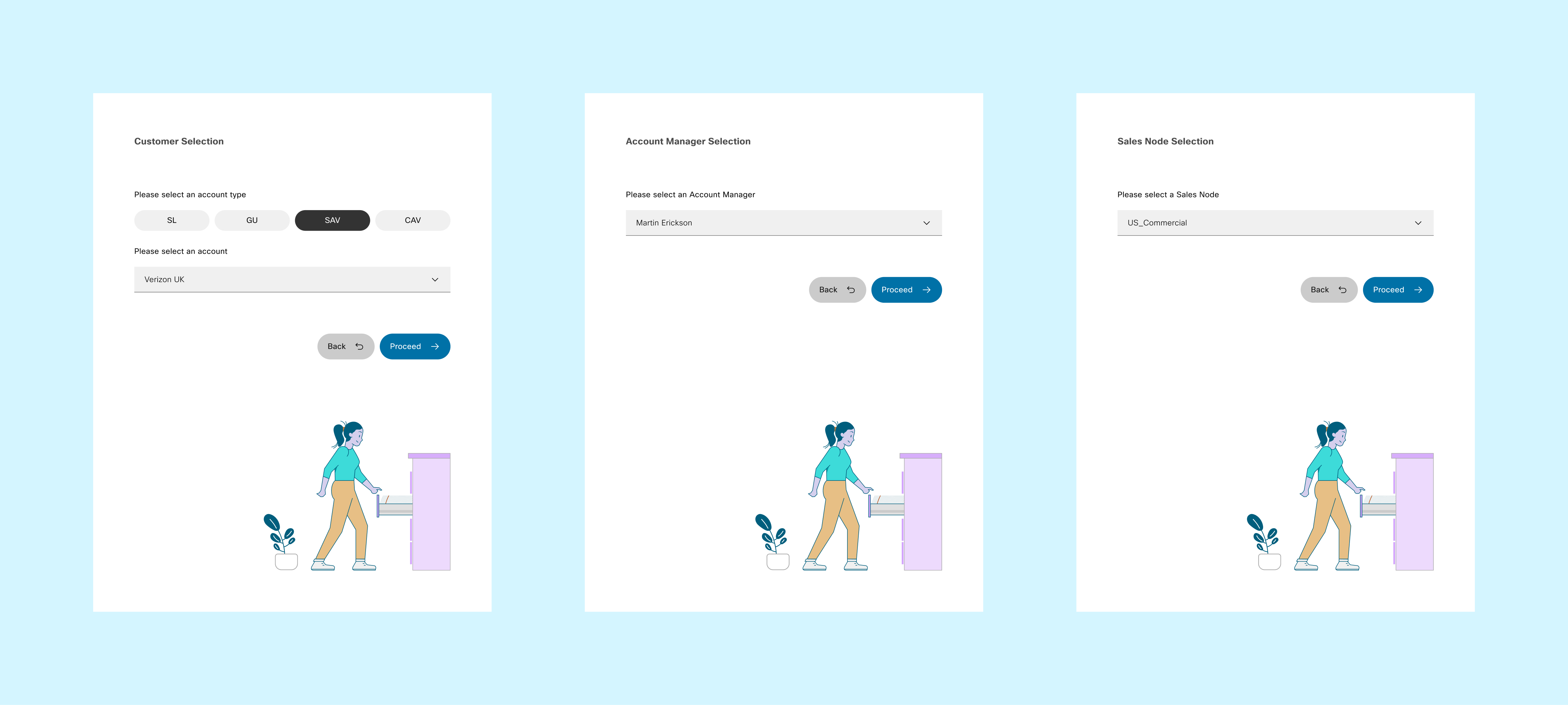
04. Standardizing Intermediate States
Due to data constraints, users had to pre-select data in order to visit an existing asset like Customer Insights, Account Manager View, CX Overview, etc.
I developed a standardized workflow to bring more consistency to our user experience.
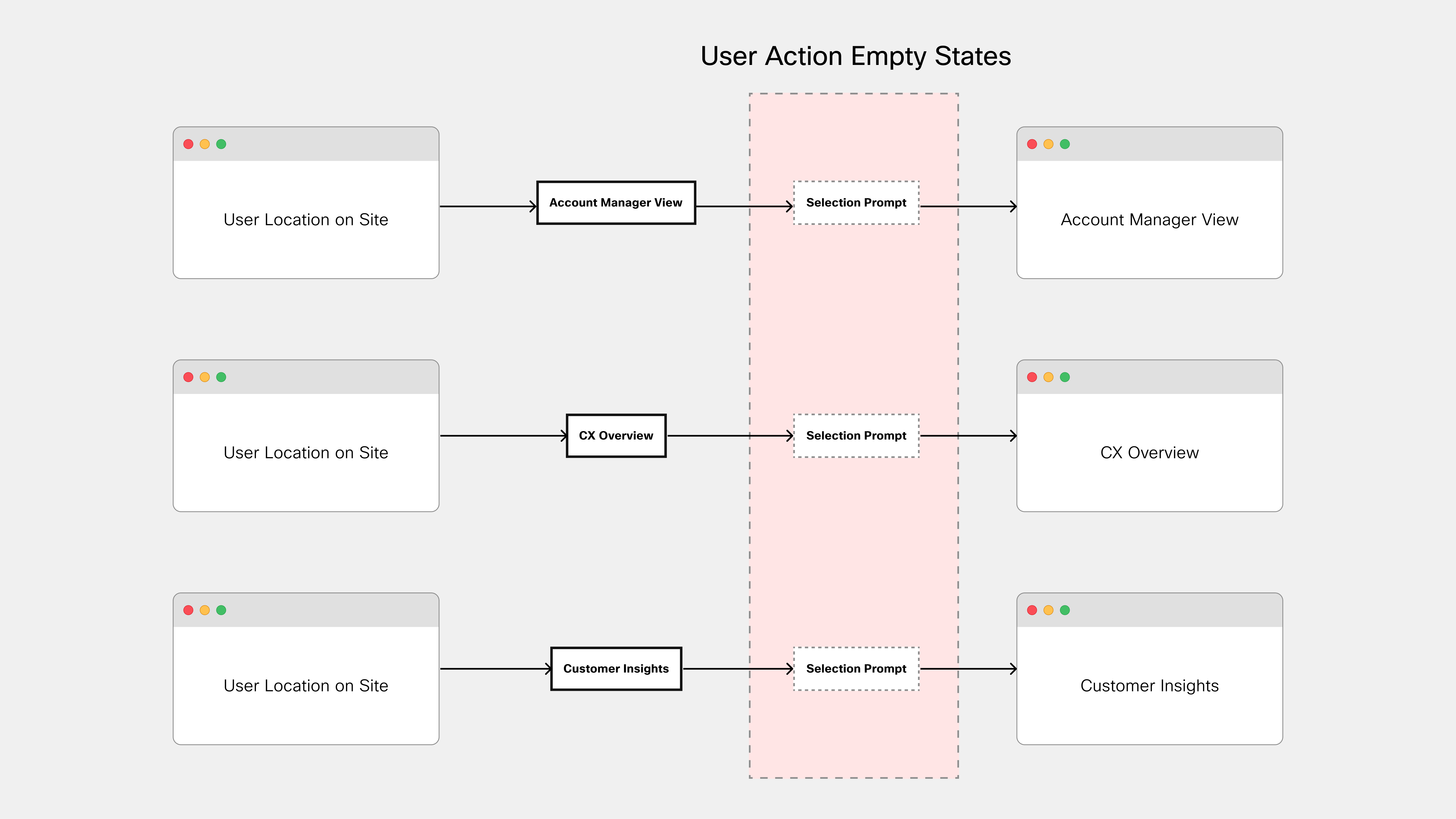
Process Diagram.
User Action Empty States.

Prompt for selecting a customer.
05. Adding Purpose to Styling
Due to the speed and volume of our work, I realized we had to move away from traditional annotation for styling elements. As a result, I began defining elements based on their purpose.
While this approach put strong constraints on design, it drastically reduced decision-making time during design and production.
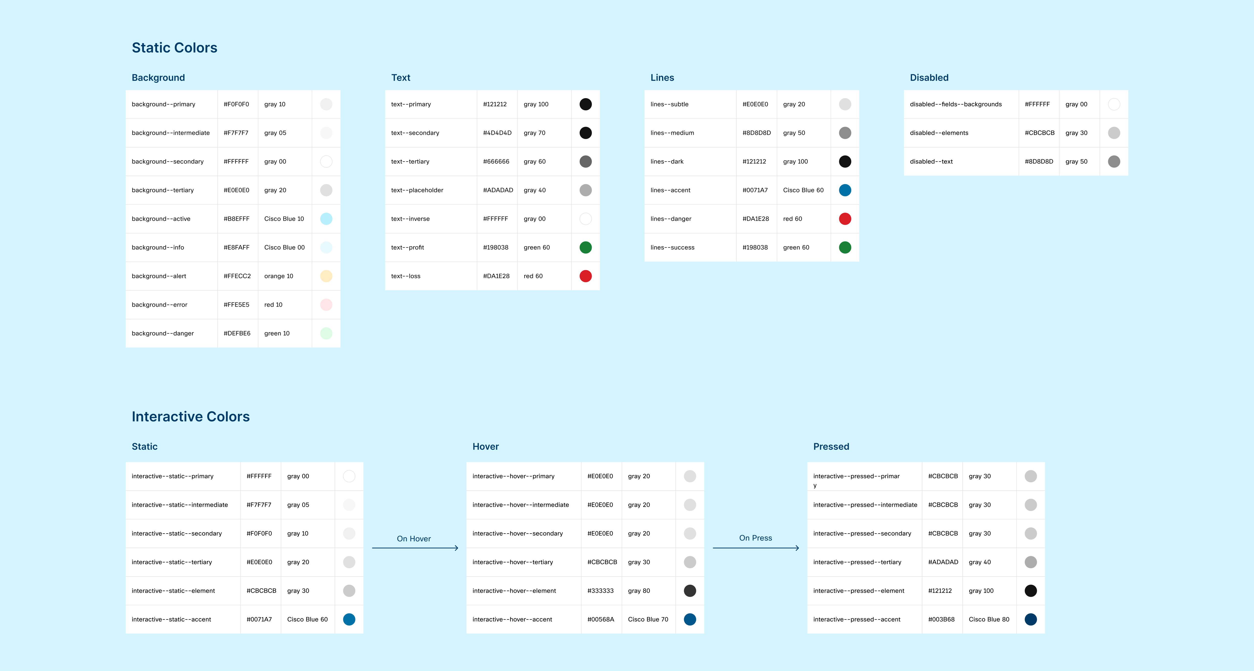
Defining color usage.
Previously, our standard b1, b2, b3... elements had to be customized for every situation and scenario. By using classes with <p> tags, we were able to create typography that was standardized and could be modified through our global library without hunting for individual elements on each page.
This also made it easier for our team to use external libraries which often require our team to use custom classes.
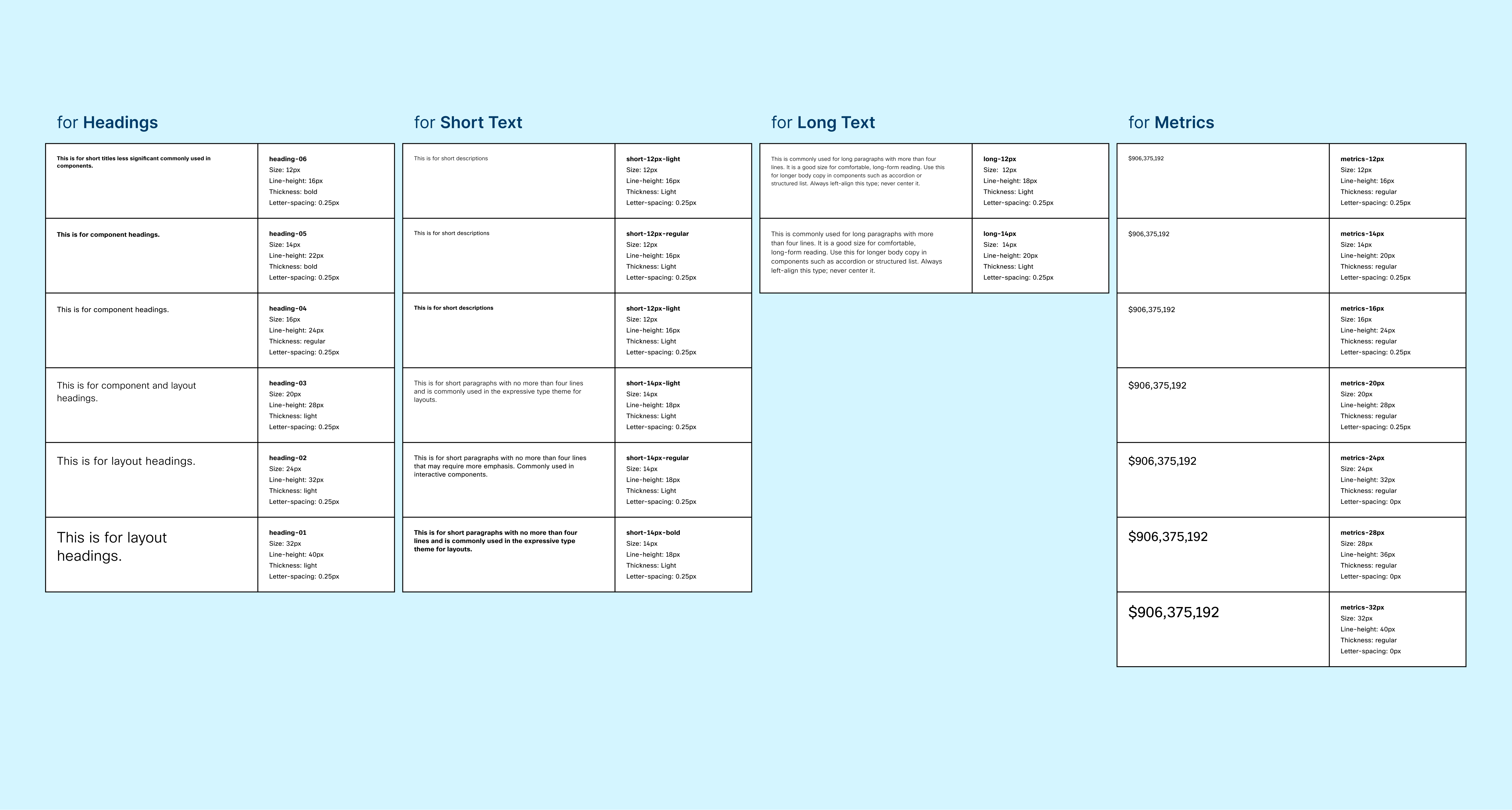
Defining typography.
Reflection:
The new look and feel of the interface always made our stakeholders and participants think that our design is fresh and innovative. In reality, I think I was always going back to traditional methods of interface design during the process.
From using the vernacular language of our users to having simplified UI elements, this process was all about taking a step back and re-evaluating every design decision made based on context and best practices.
This is not to say that we shouldn't innovate. Every problem is unique and deserves its unique approach and solution. But